ENTOMOLOGY ICONS
The goal of this project was to design a unified series of icons all pertaining to Entomology, the study of insects. Coming into the project not knowing much about insects, I was excited at the potential the topic held. I knew from the beginning that I wanted to explore what made each category different, while still allowing them each to be classified under the overarching category of Entomology. This project not only highlighted the struggles that can come with making a cohesive symbol system, but it also emphasized the importance of user testing. As designers we can try to get into the mindset of what the public will interpret the system as, however, testing the symbols puts them under a whole knew light. It can confirm some of what is working for the system, while more importantly highlighting what isn’t successful. While style can play a key factor in legibility, it is the overall aspects, size, and gesture that truly defines the symbol.

STYLE SKETCHES
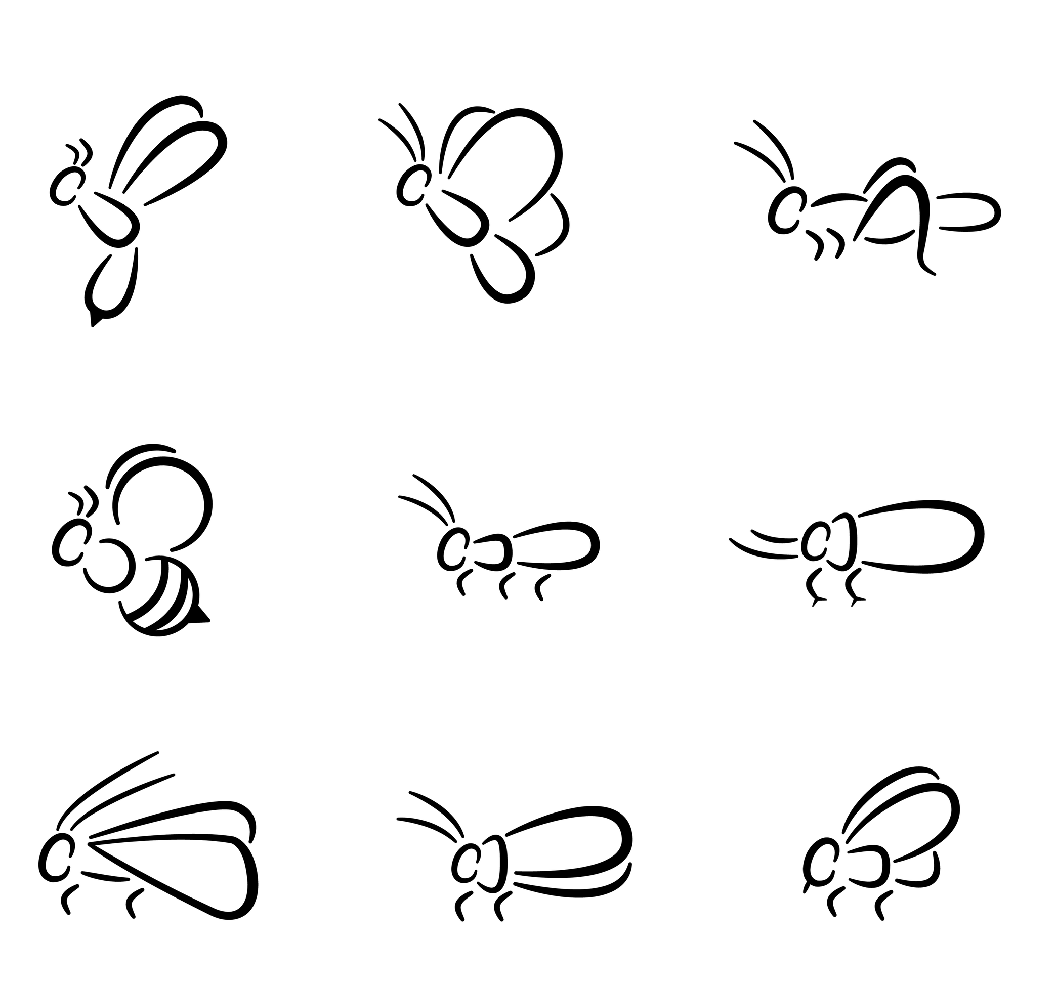
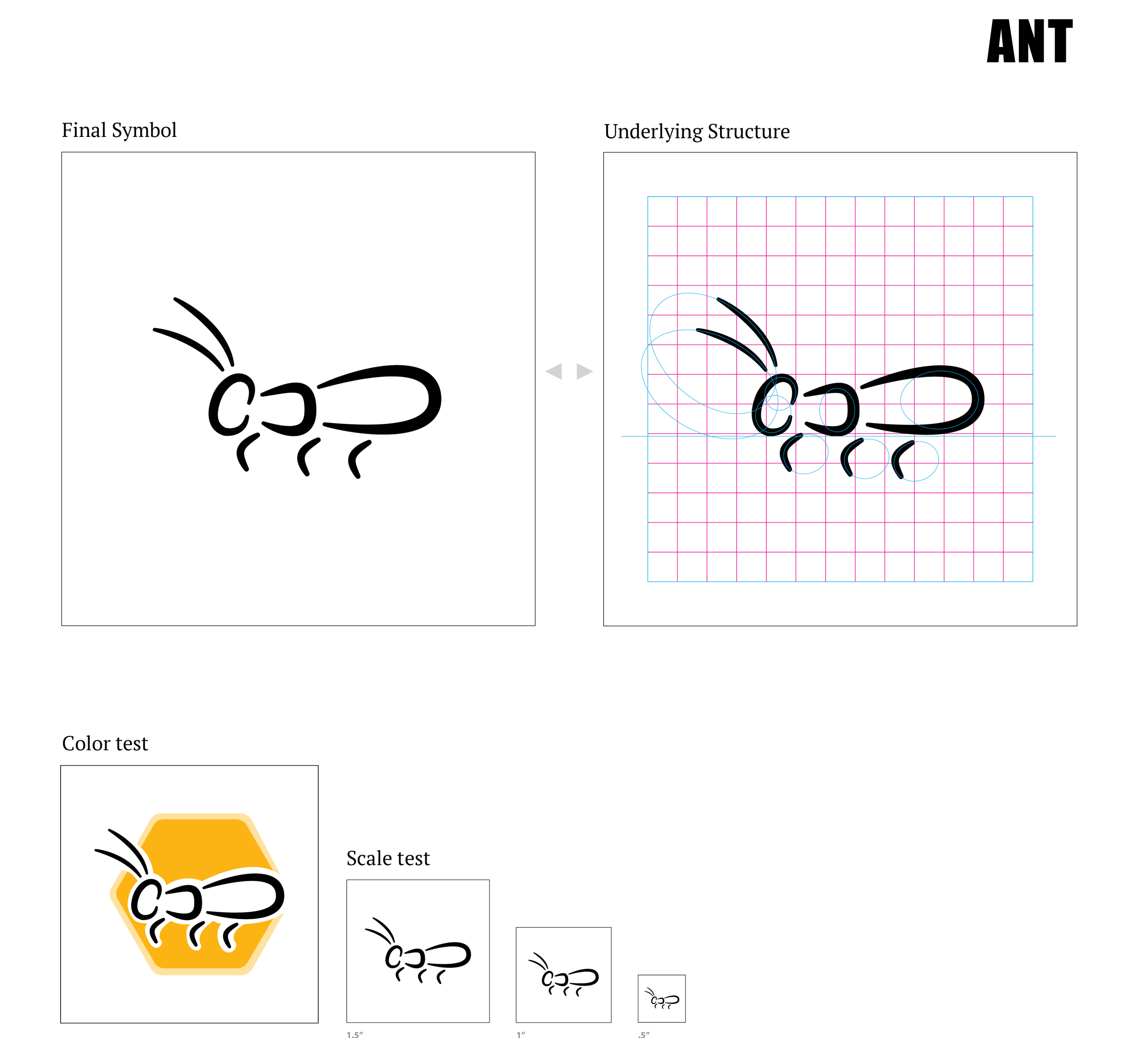
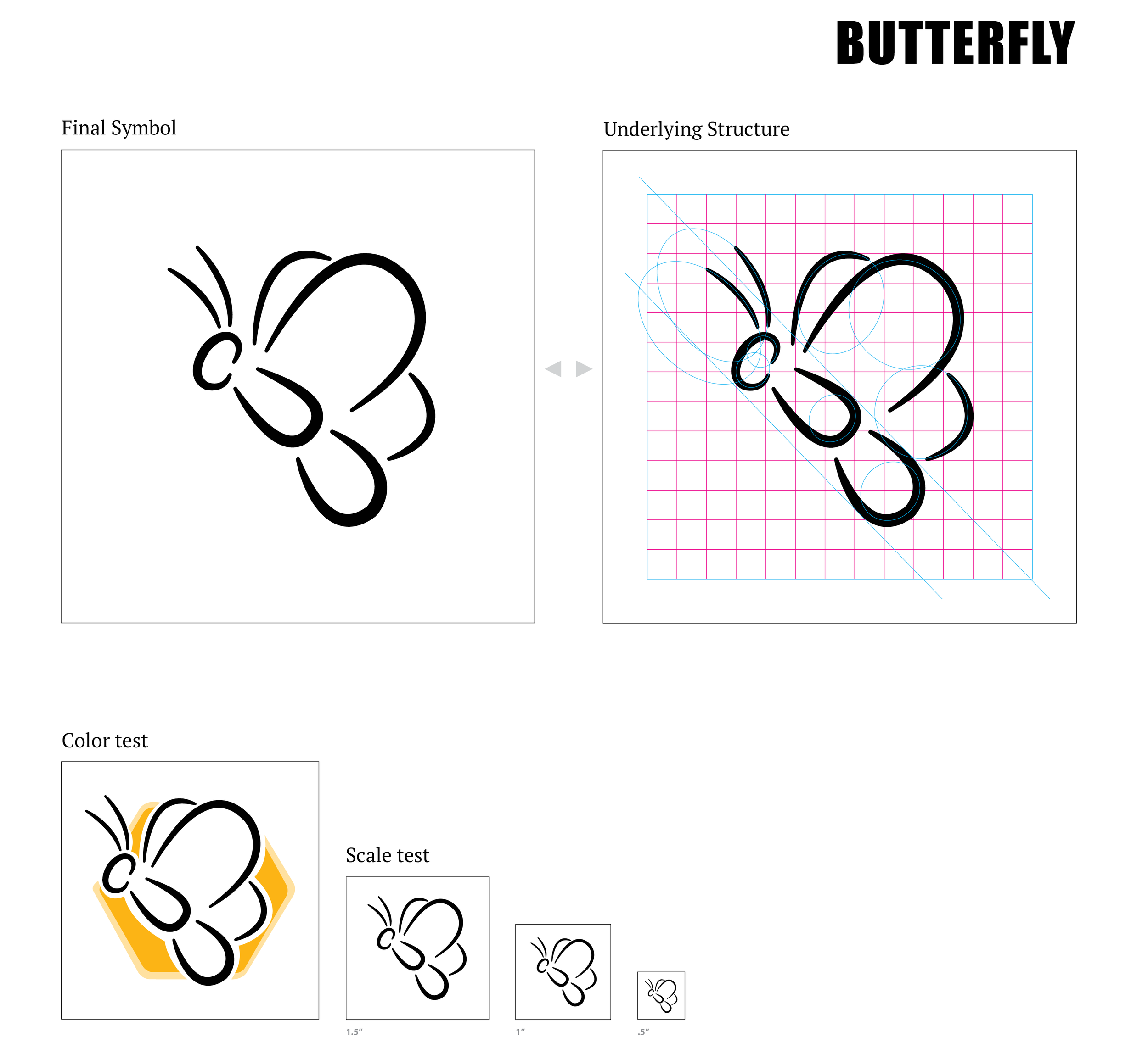
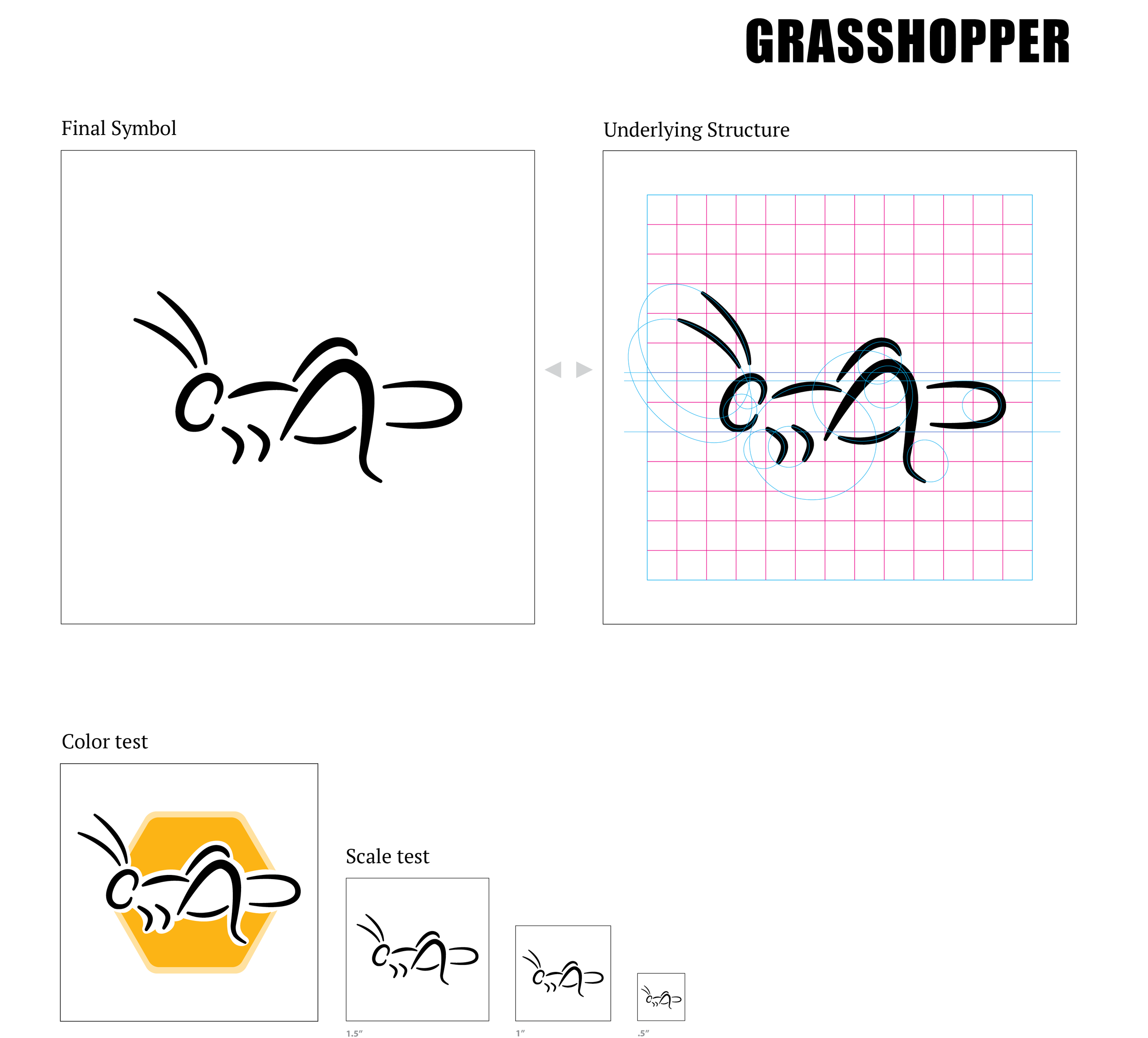
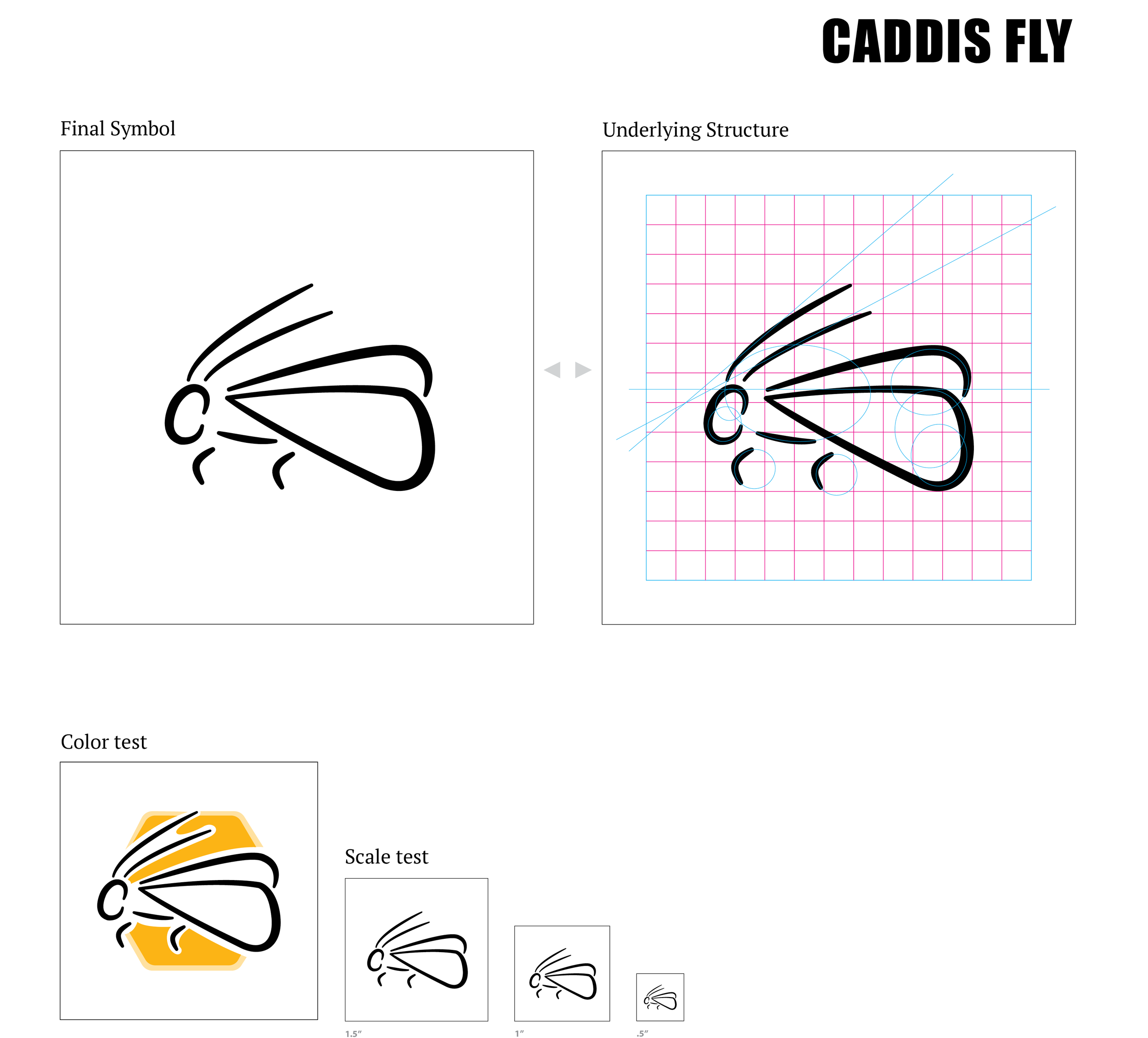
When it came to sketching out different ideations, I experimented with an array of different styles and perspective. I went back and forth from a thinner, more detailed, scientific looking approach and a bolder, simplified, silhouette. Exploring with perspective, I wanted to find an angle that would work across the board for all insects. While some insects lent themselves to a side view being the most legible, others showed more resistance toward the perspective.
DIGITAL ITERATIONS
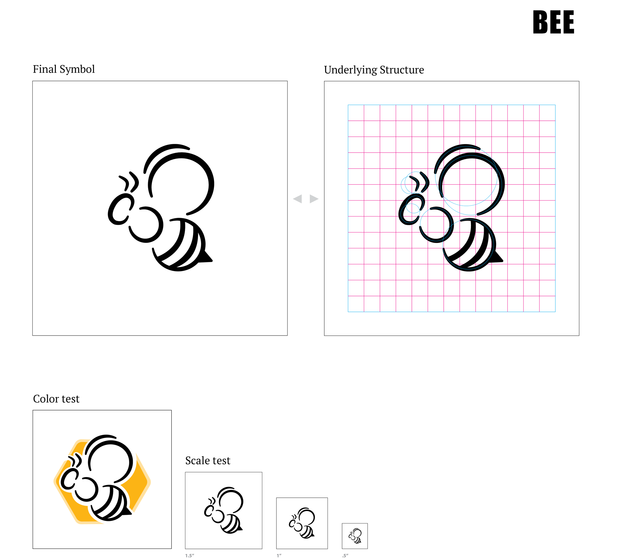
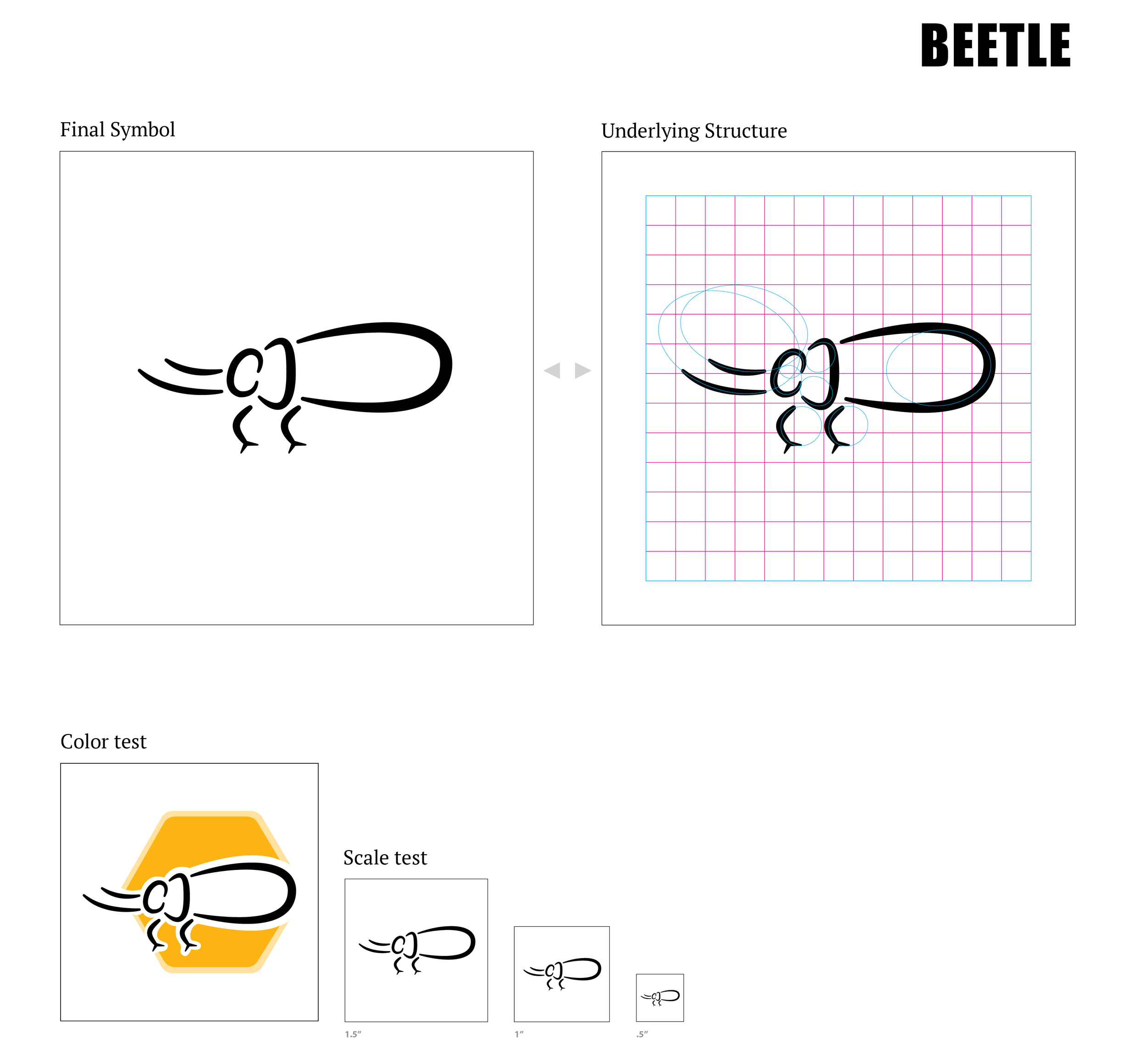
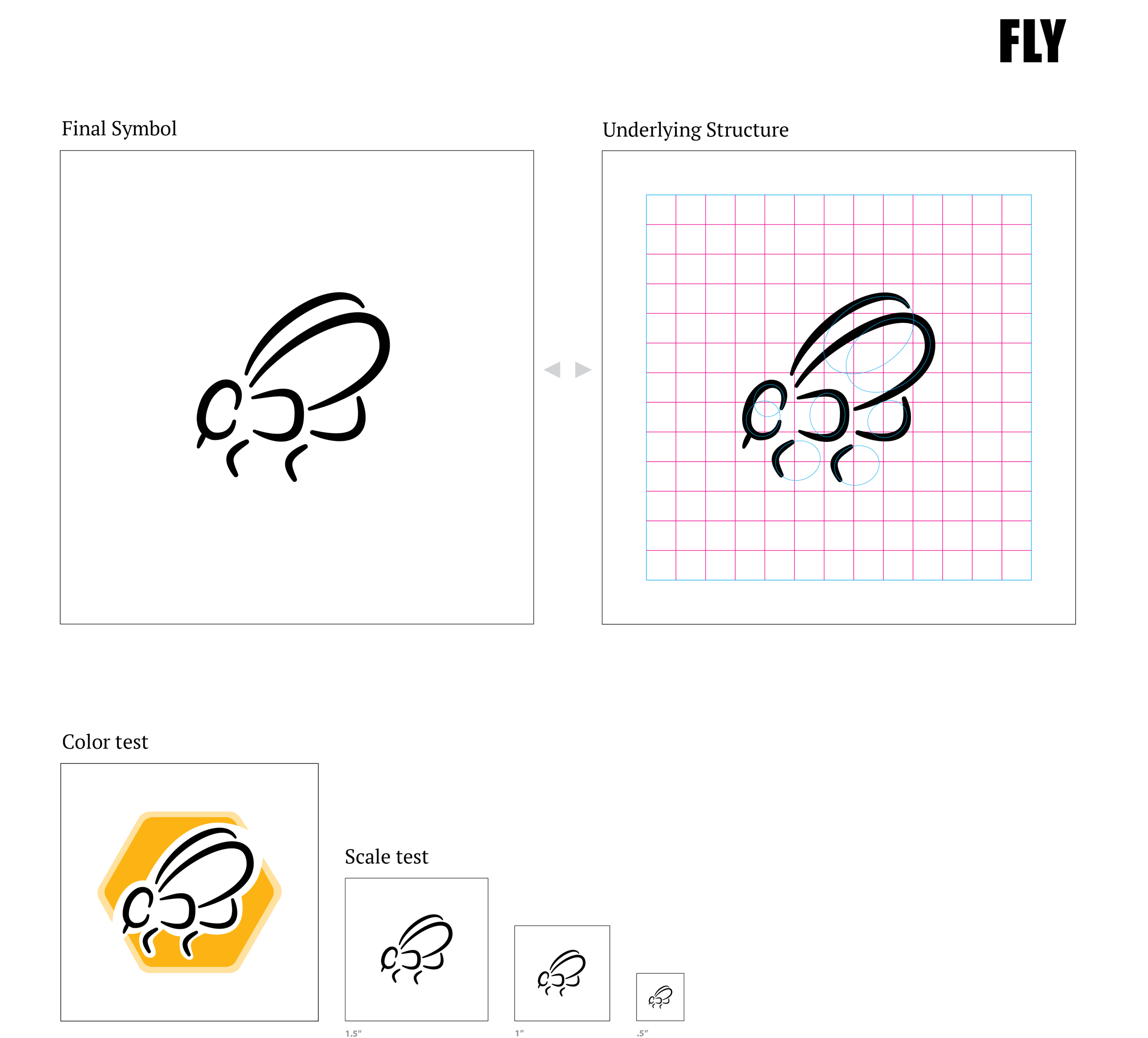
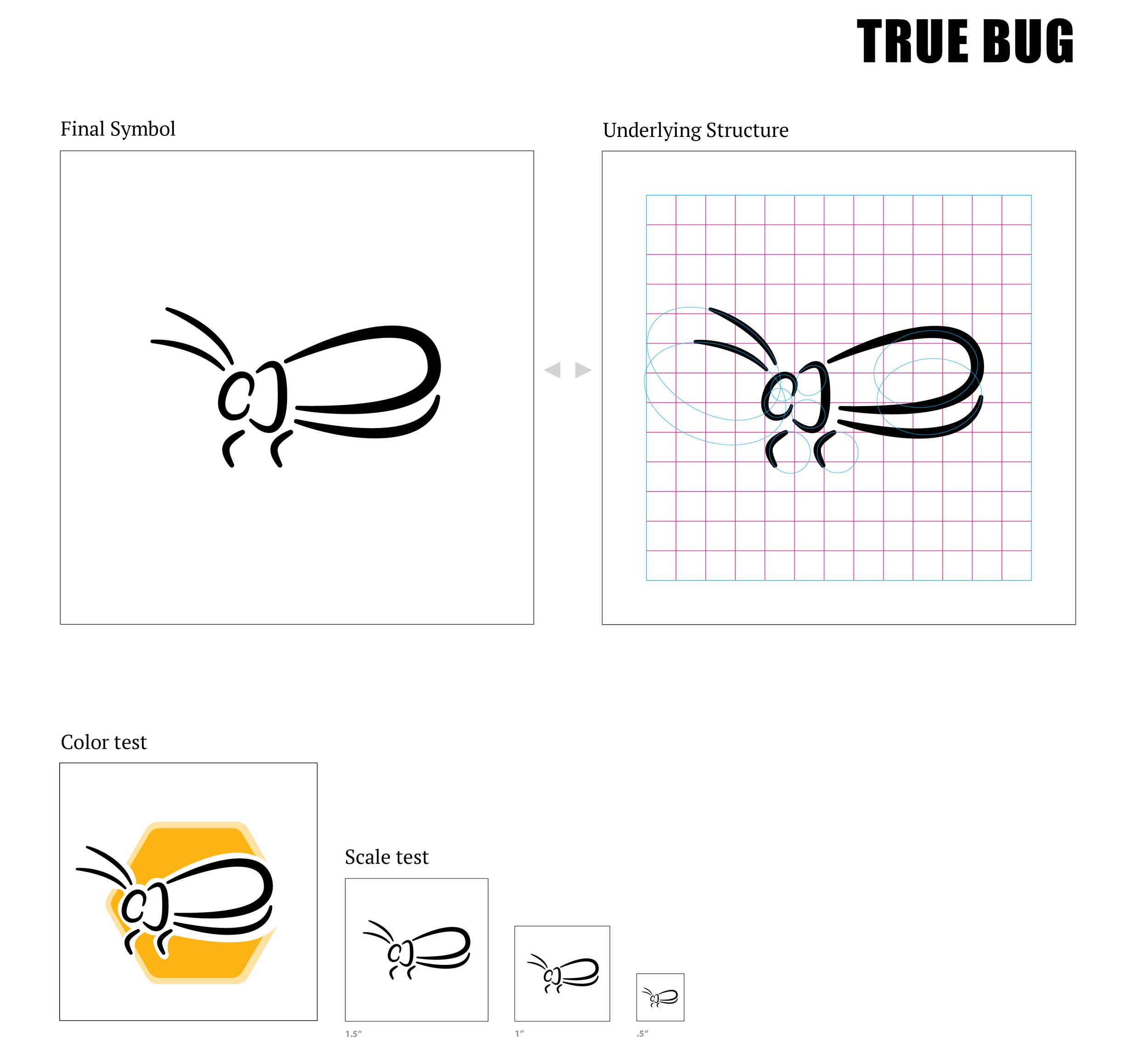
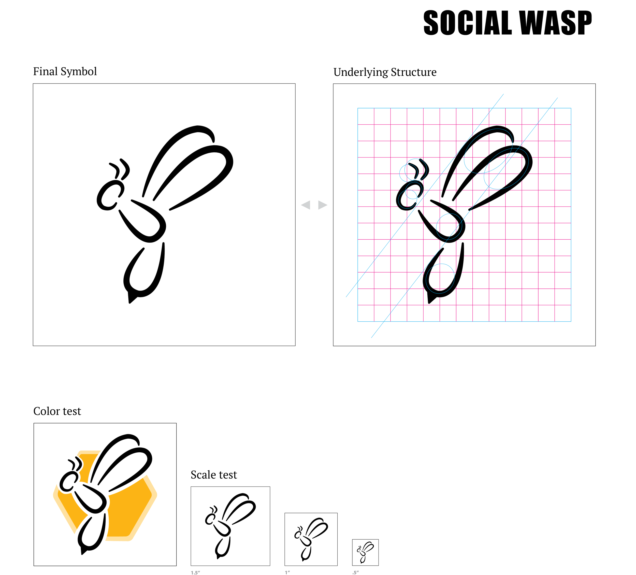
In converting my sketches to digital iterations, I focused heavily on creating common shapes that could be used to no only unite the series, but additional make the key features of each insect stand out more. Once I brought my sketches into digital translations, I focused on the individual gestures of each insect because this plays a big part in how a viewer sees an insect. For example: butterflies have light and gentle nature about them, while a wasp should be more hard and aggressive.
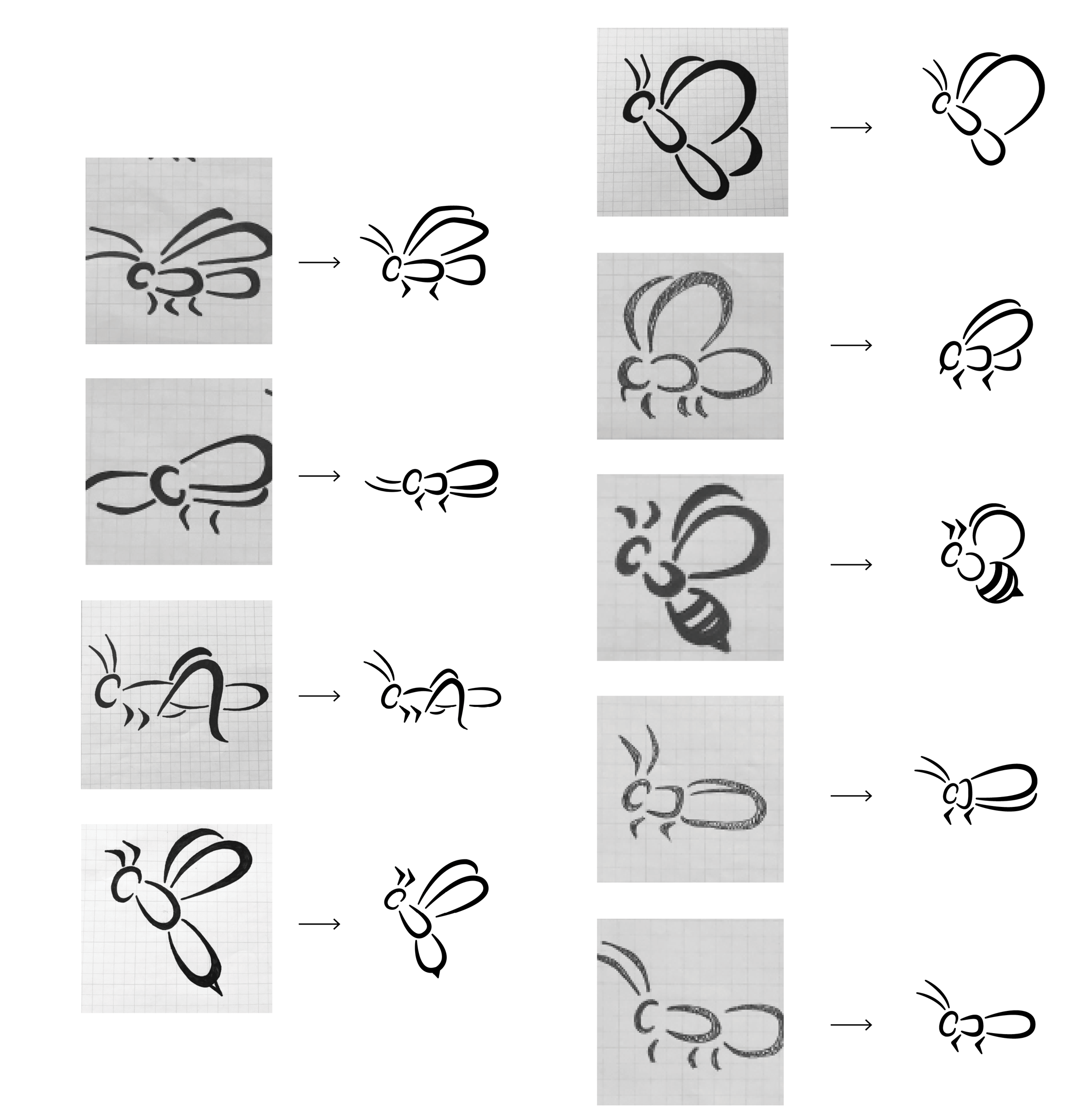
Digitalization

Form Iterations
USER TESTING
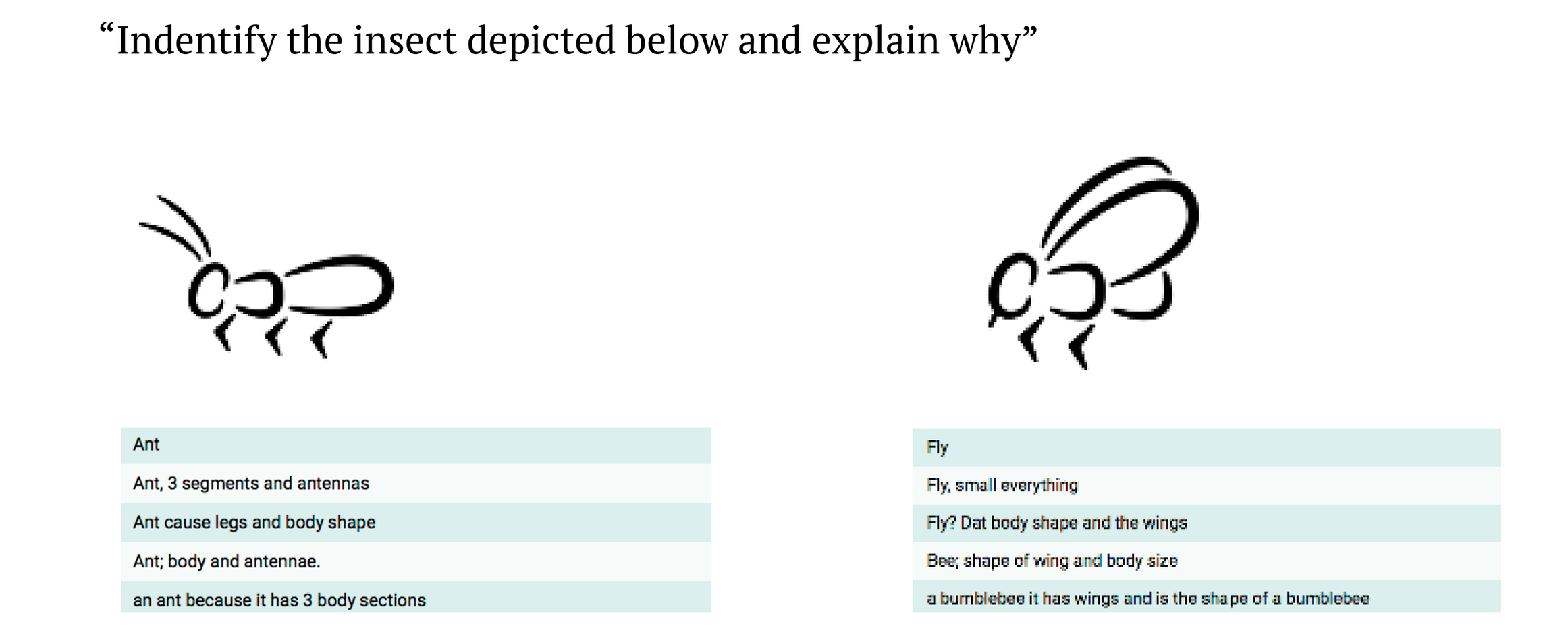
For the first round of user testing, I was looking for affirmation from the viewers that the style approach I was perusing made each insect distinguishable from one another. Round 1 of user testing pointed out a comprehensibility issue with the beetle symbol. While the shape of the body became an issue in identifying the symbol as a beetle, the user testing showed me that it would be an effective shape to transform into the ant symbol.


My approach for the second round of testing was to present the users with the symbols that had proven to be the easiest to miss identify. To better understand the aspects that caused any identification errors, I asked the viewers to further explain what characteristics of the symbol stood out and helped them identify the symbol.

FINAL SYMBOL SYSTEM

APPLICATION
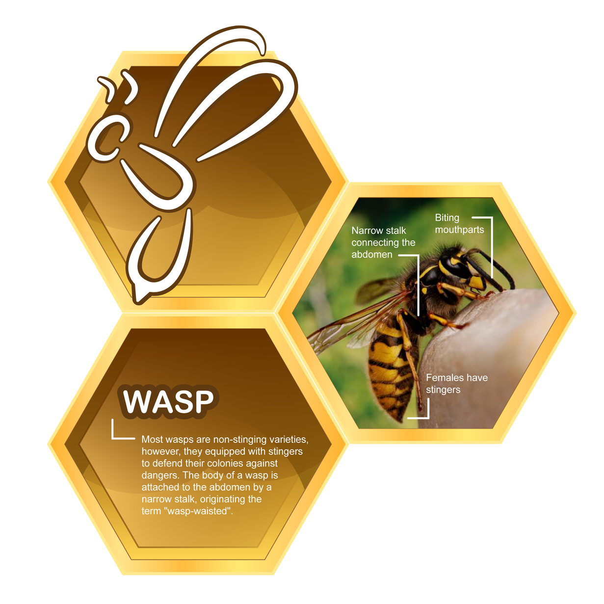
Going off of the fun and playful line gesture used for the final symbol series, I wanted to implement the symbols in a setting that would enhance that nature. For my application, I applied the symbol system created to an insect exhibit that could be found in a children’s science museum. I wanted to keep the playful nature going throughout the exhibit while trying to draw in kids attention to learn more about each insect.

For the exhibit panels themselves, I used the hexagon shape as a feature reminiscent of a honeycomb, so the viewer see’s it and thinks of bugs already. I then juxtaposed the symbols with an actual image of the insect so the graphic representation draws the viewer in, and then the image further informs them of key characteristics for each insect.