
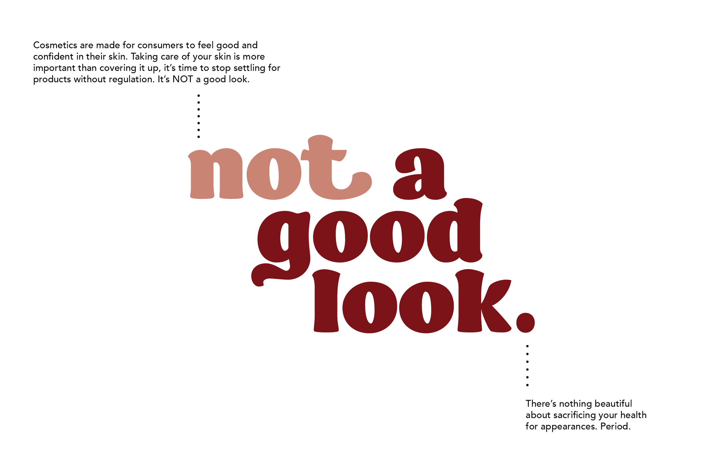
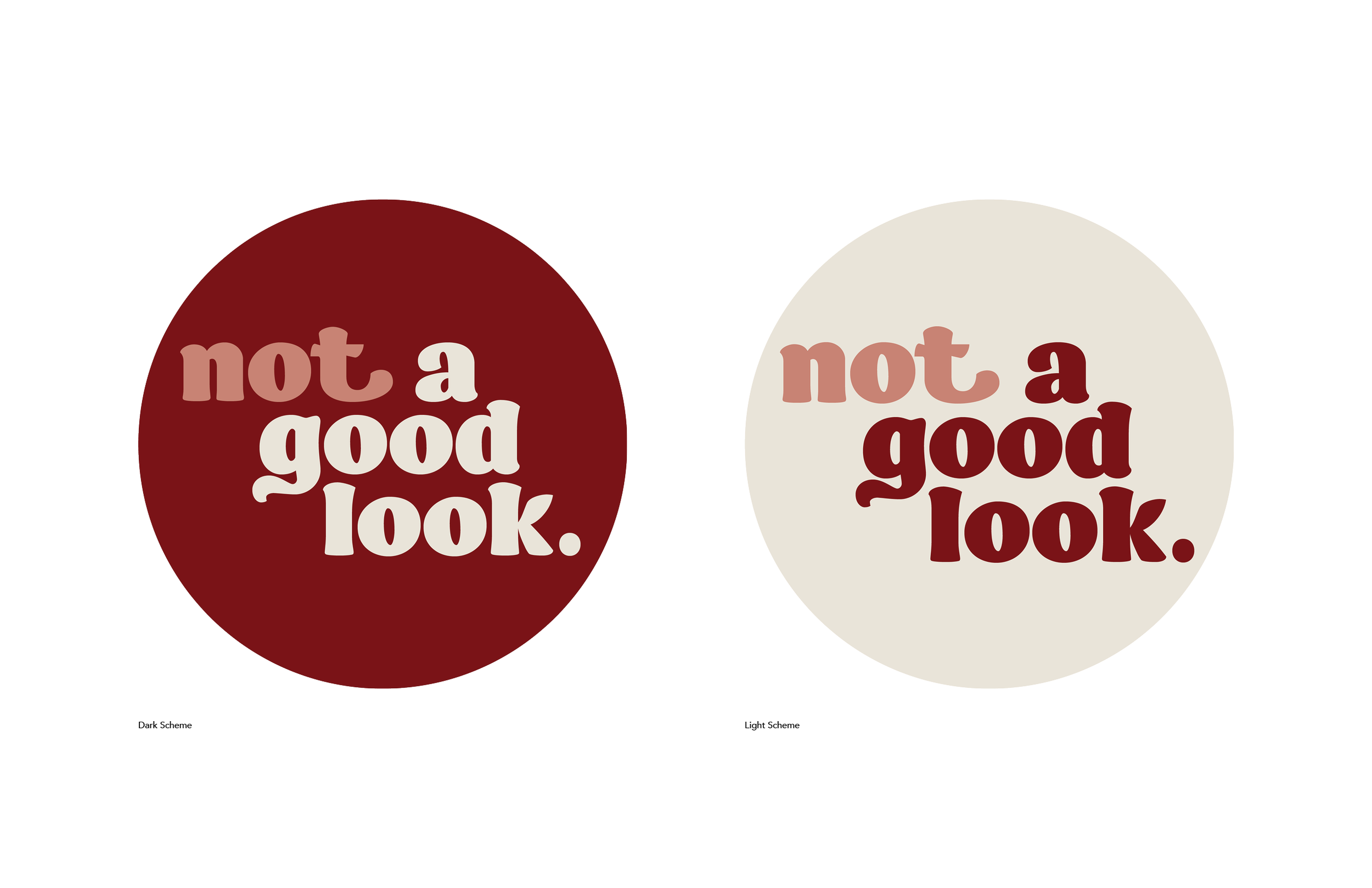
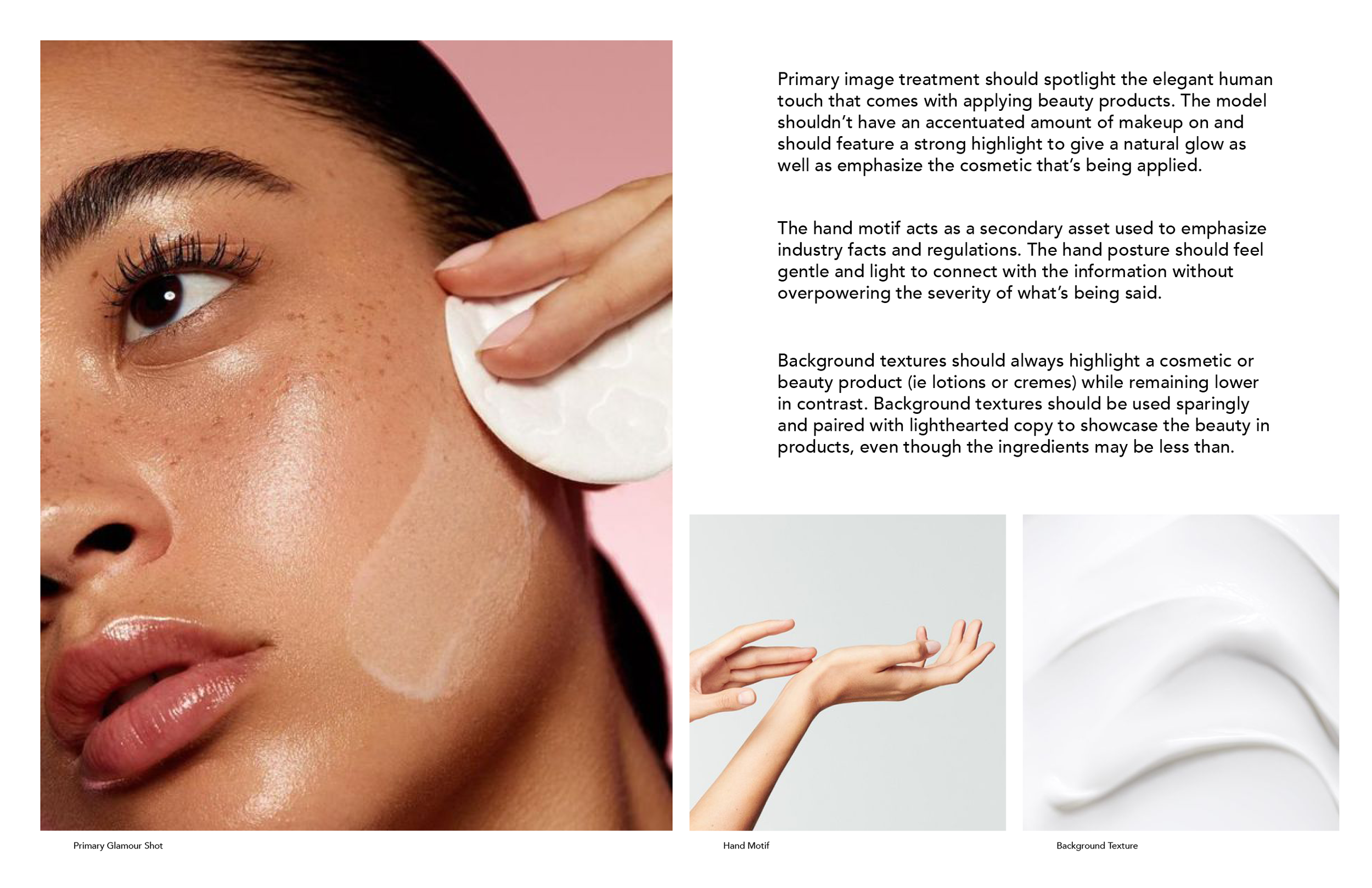
Not a good look.
Not A Good Look. is a social campaign with the mission to educate consumers on what exactly the complicated names in beauty products mean, and why you should care what’s on the label. Most people assume cosmetics and personal care products are tested for safety before being stocked on store shelves, when in truth; beauty products are one of the least regulated industries in the U.S.

Defining the Problem
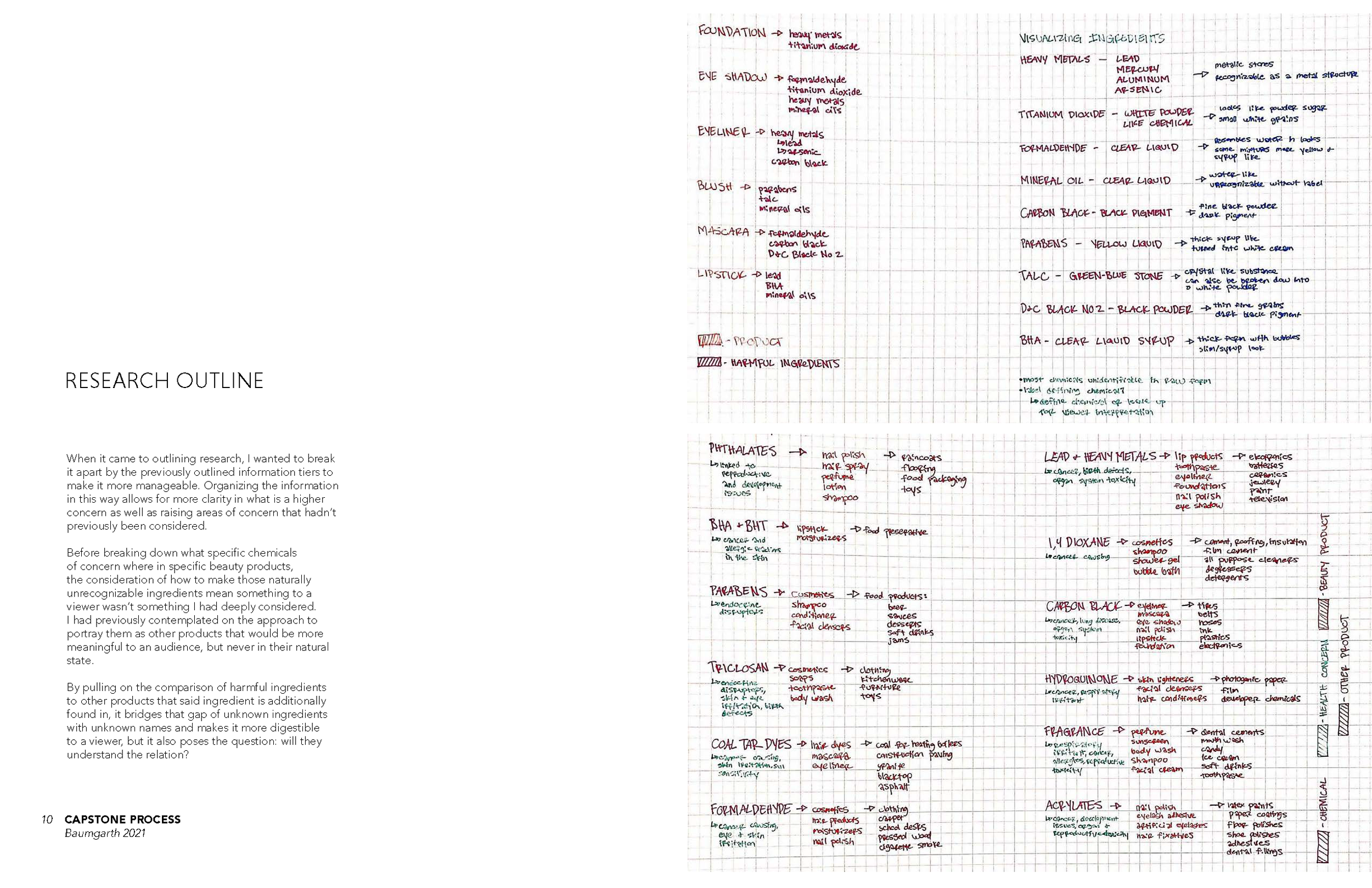
When it came to outlining the research space, I wanted to focus on a variety of problems that lead to the overall health concerns within the beauty industry, and thus additionally keep it open ended for the time in potential design intervention spaces.
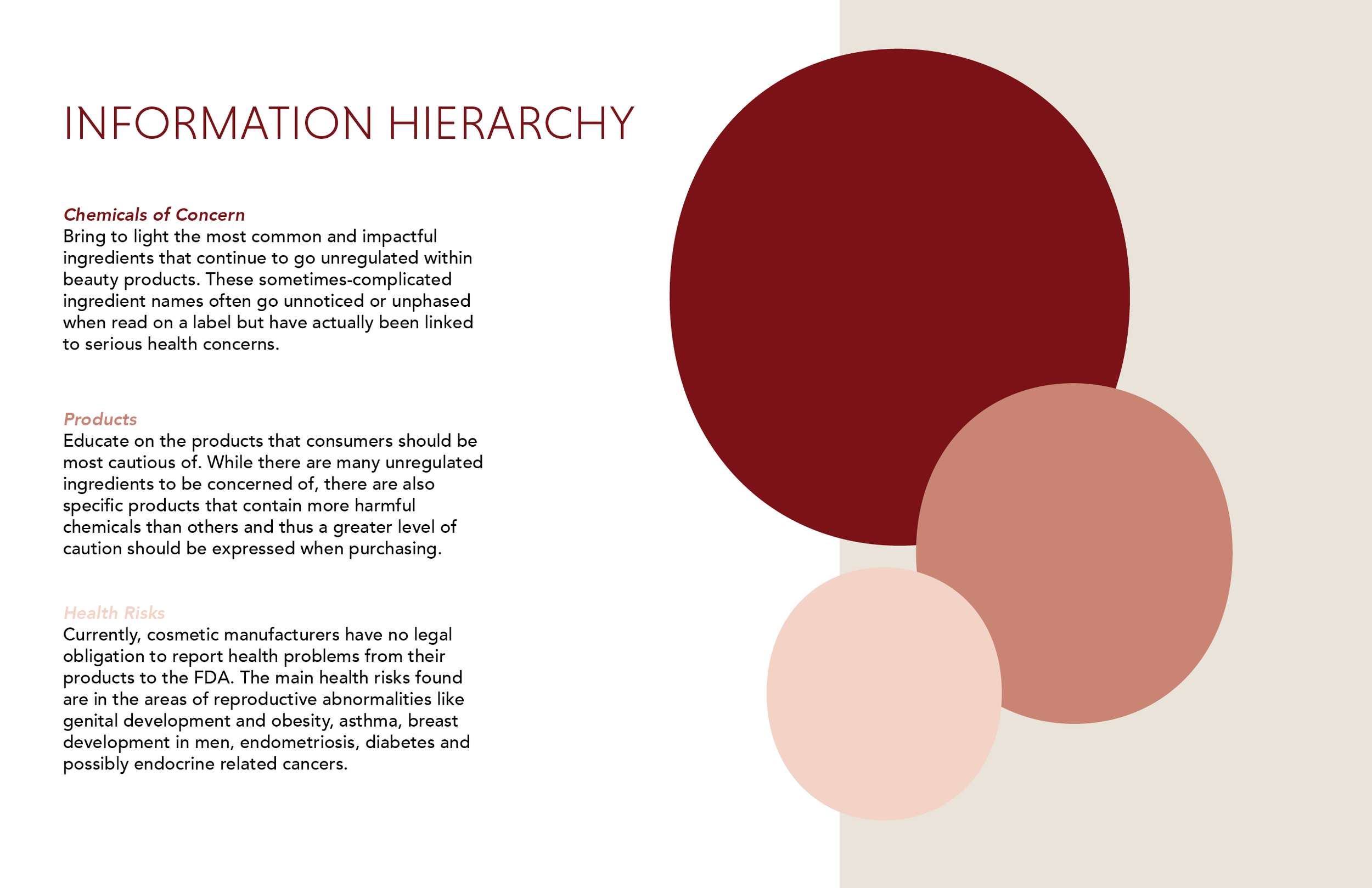
The main areas contributing to the overarching health concerns are the continued use of harmful chemicals by big name beauty companies, the greenwashing of packaging- promoting false or inflated claims of cleanliness, the unknown affects using specific chemicals within products can have on the body, and an unknown of cleaner beauty companies/where to start when it comes to transitioning to cleaner beauty products.

Research and Insights
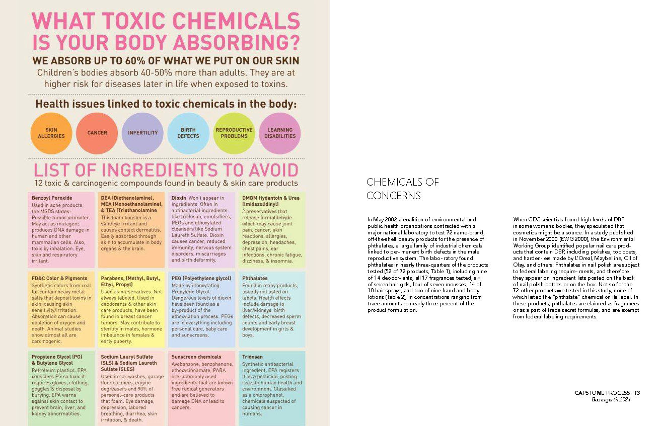
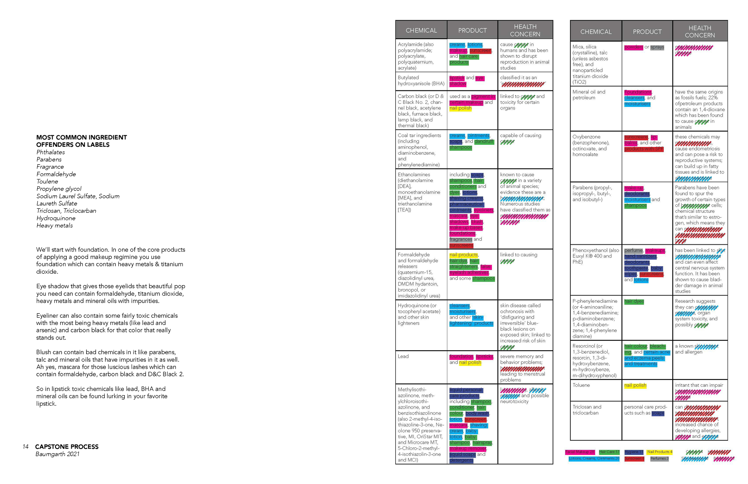
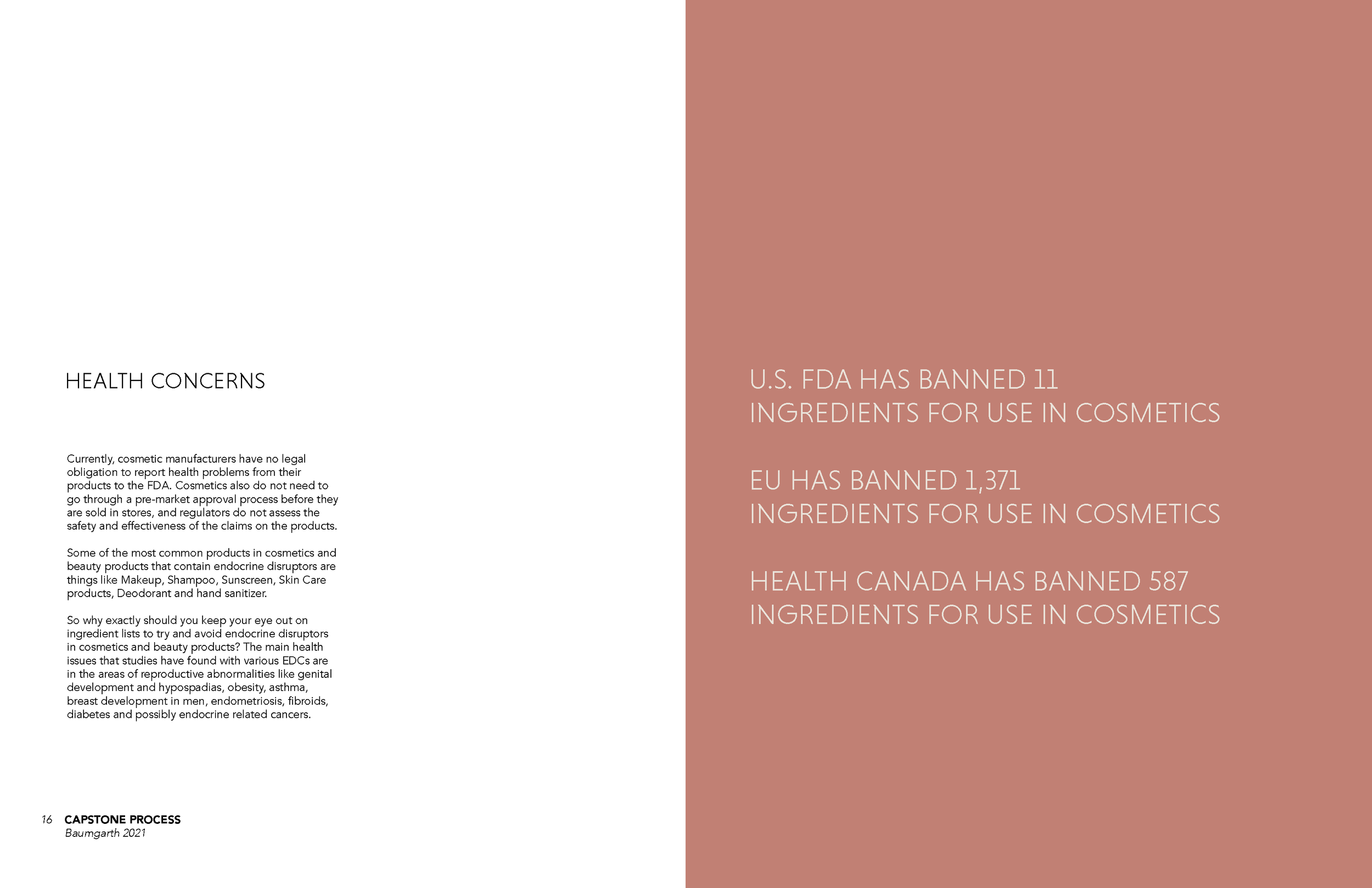
With the rise of media bringing attention to beauty influencers and bloggers, the industry is continuously attracting attention and promoting the heavy use of makeup. While 64% of products applied to the skin are absorbed into the body, the $200 billion dollar beauty industry is only regulated by one and a half pages of laws.
Check out the full research process for a more in depth look at health risks and regulations in beauty.
Concept Exploration
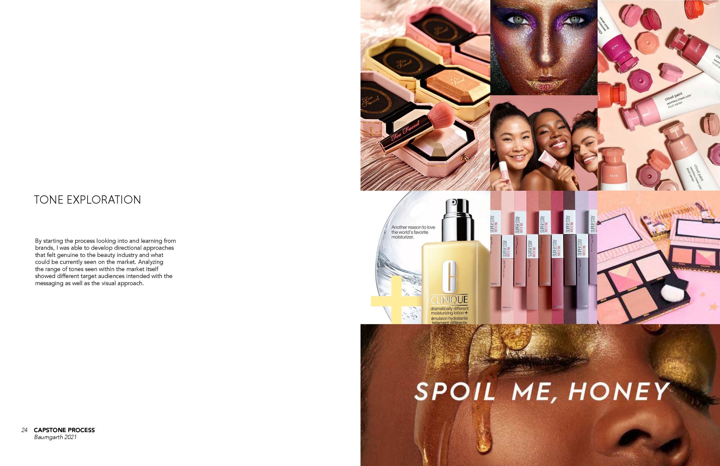
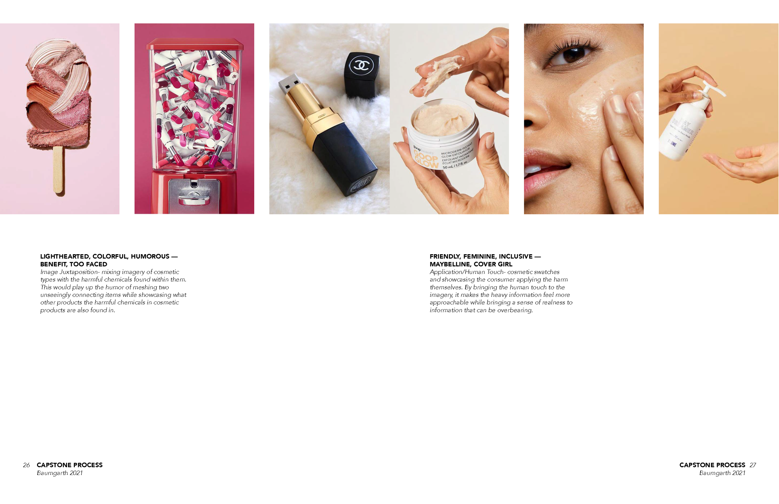
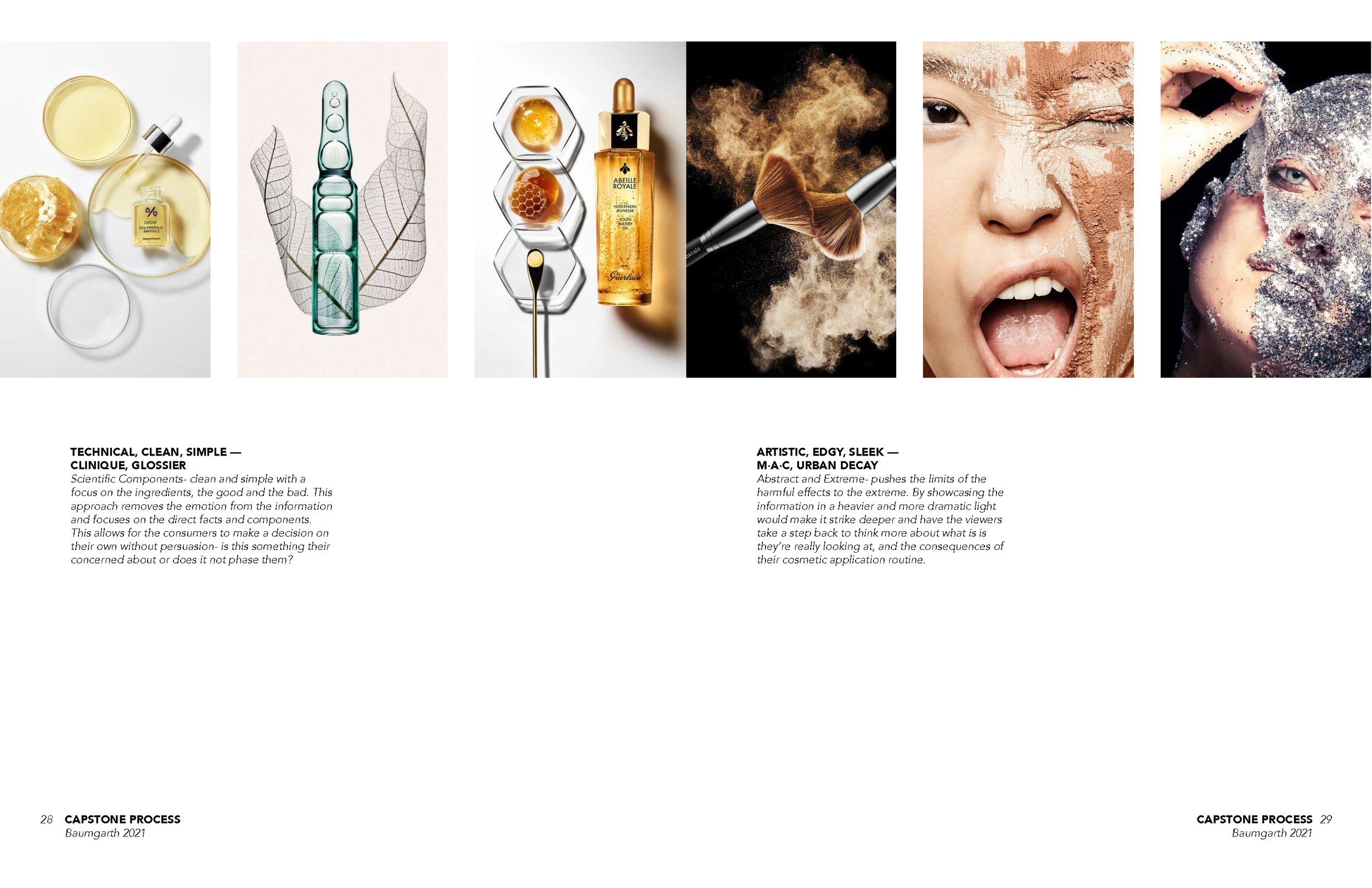
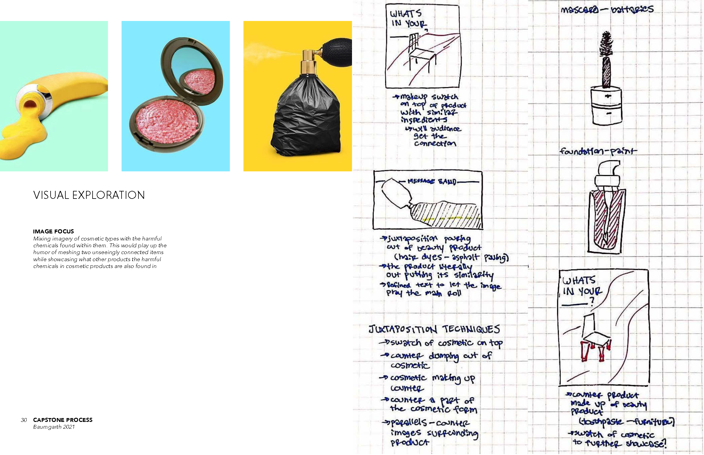
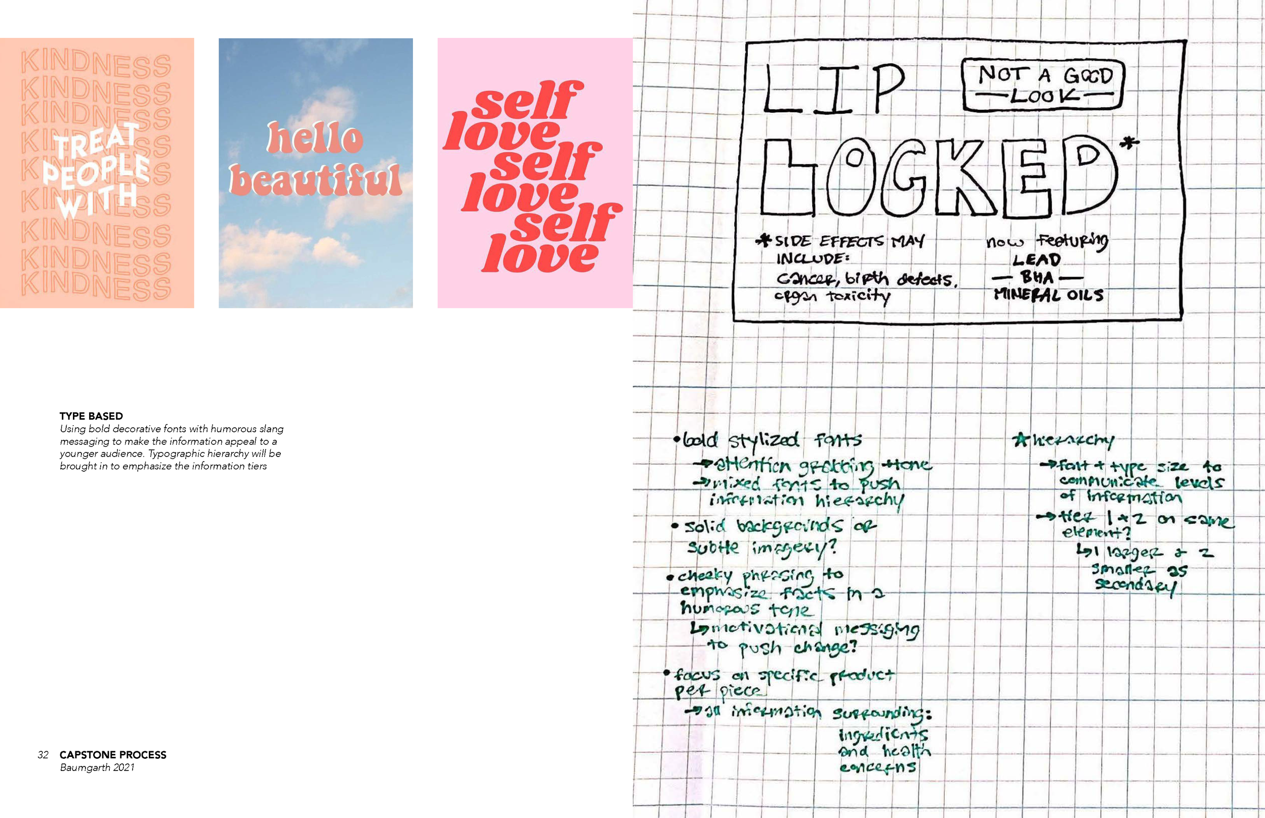
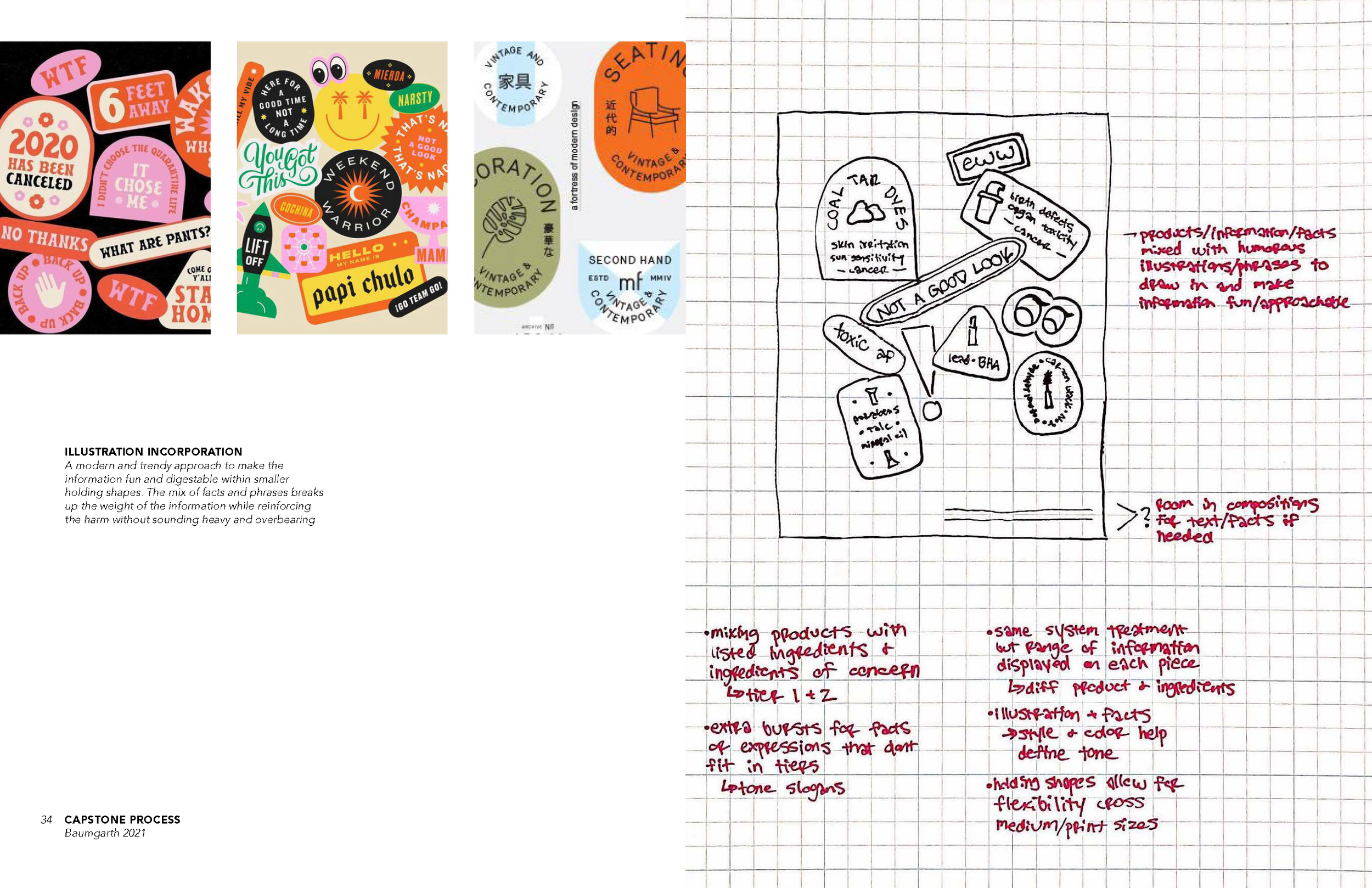
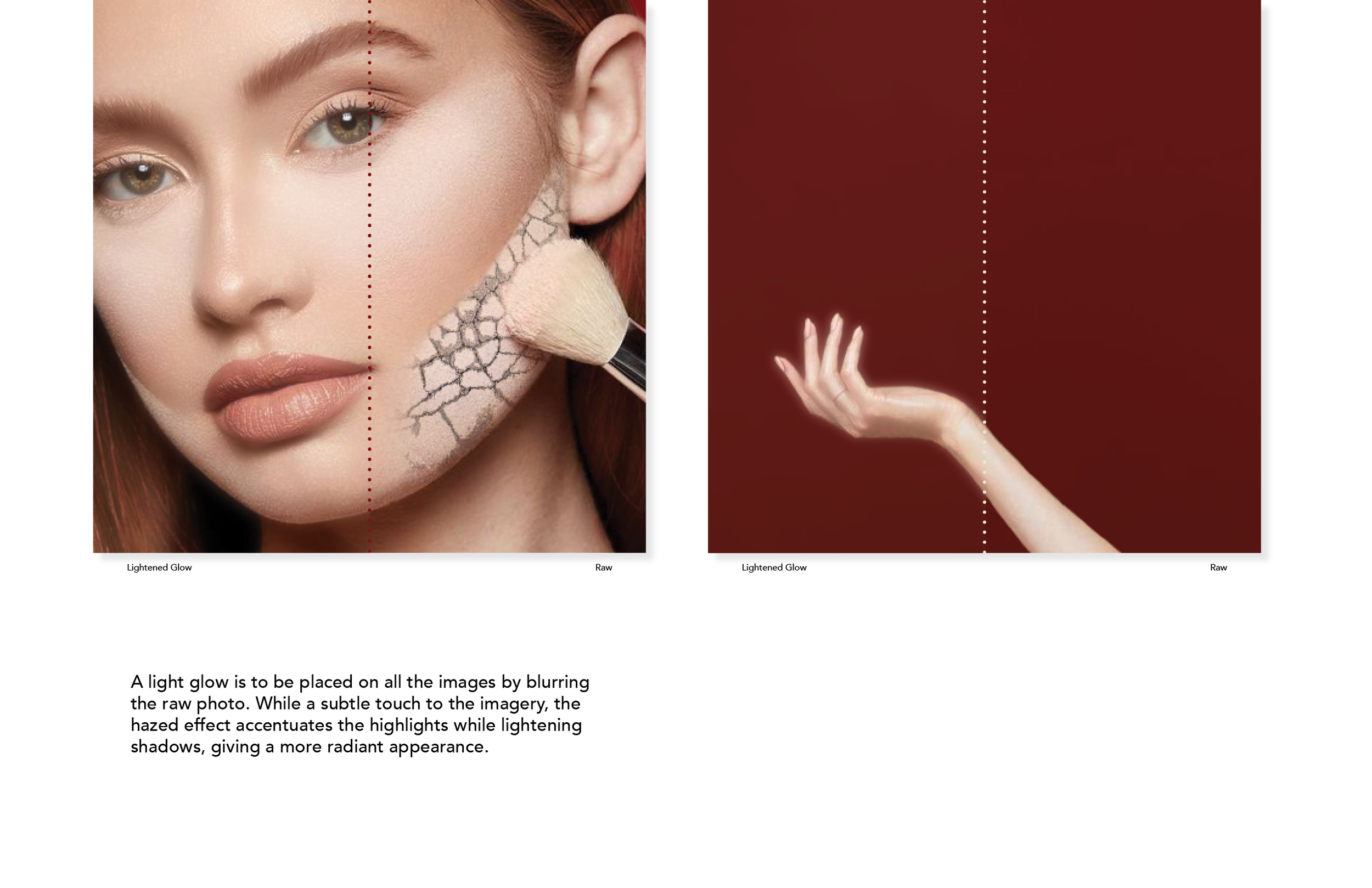
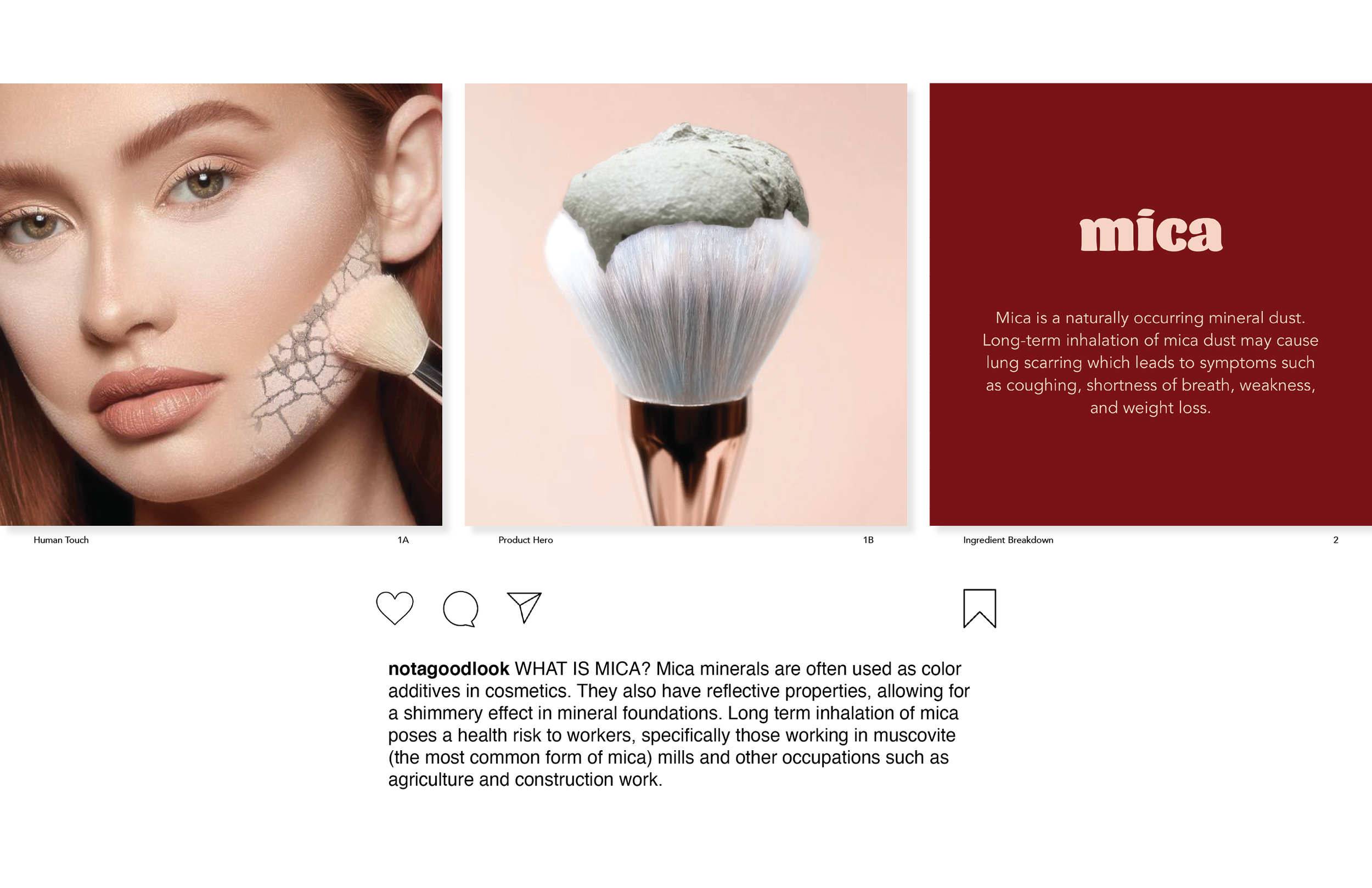
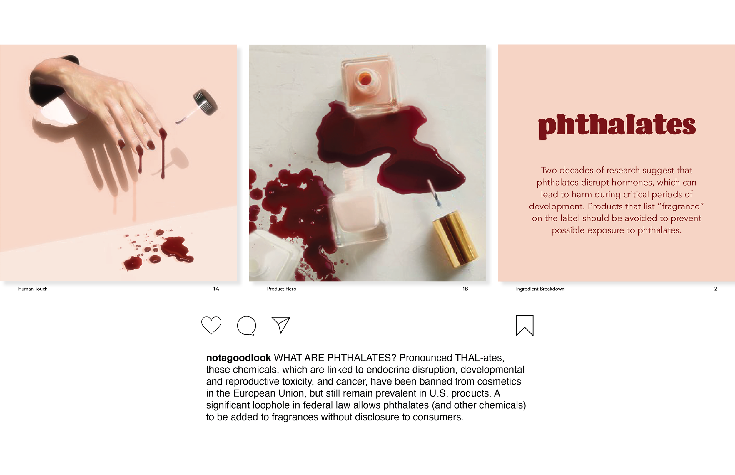
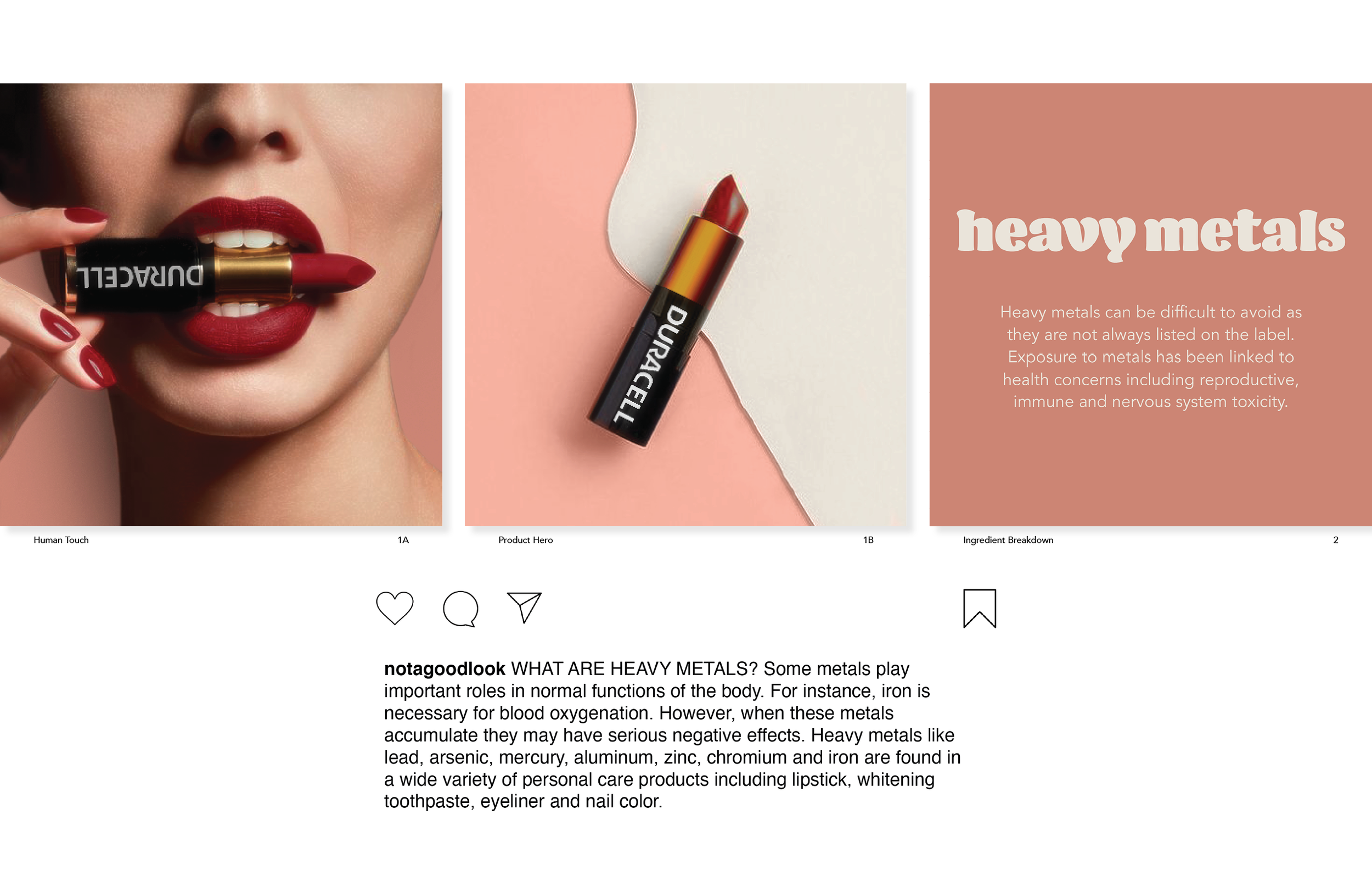
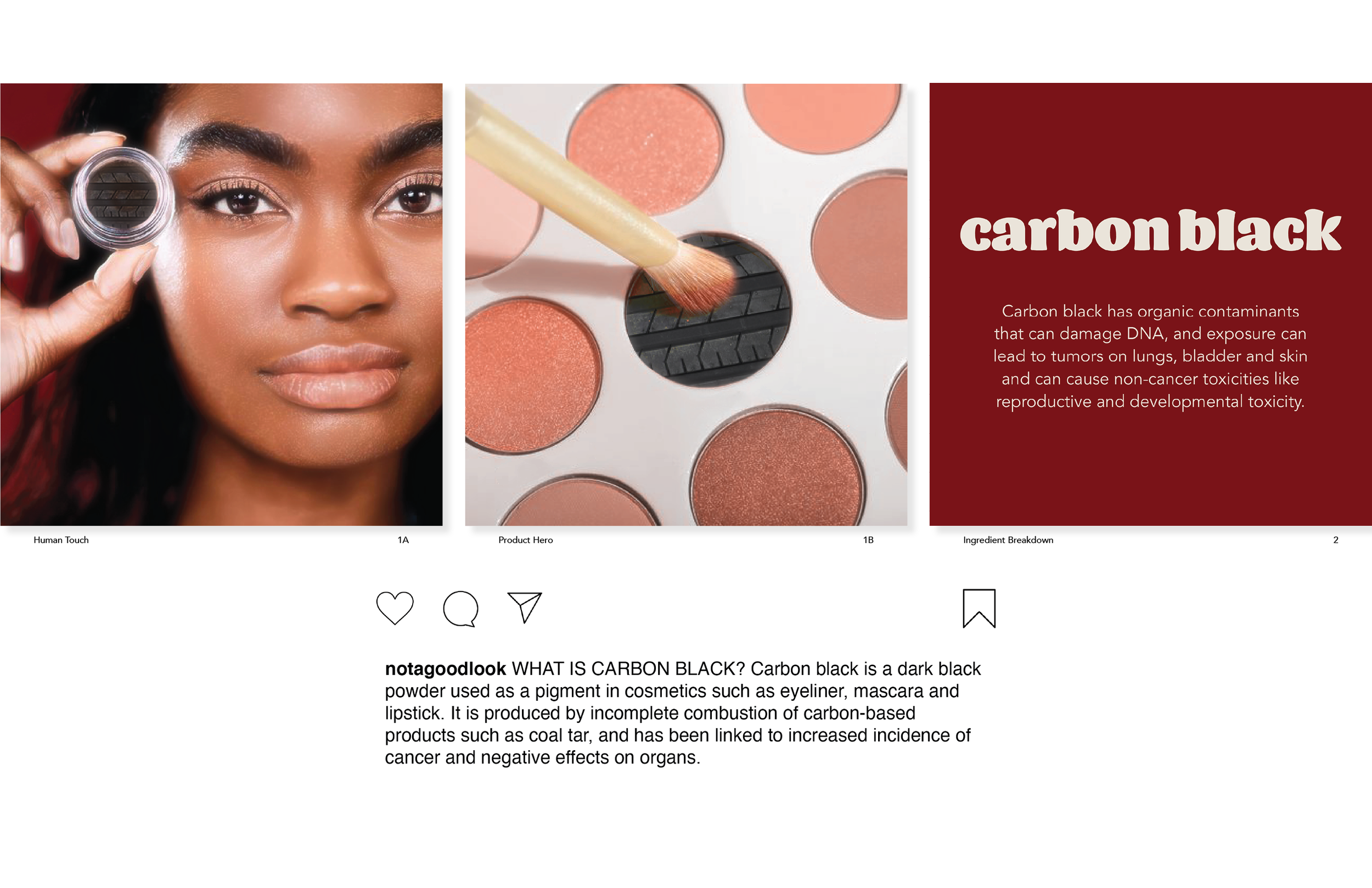
In exploring the technique of juxtaposing images for health concerns and beauty products I focused on two directional approaches- image pairing vs image blending. In both explorations the comparison is pulled between a beauty product and a product that shares a similar chemical. This connection stimulates thought about what is being expressed while shining a different light on chemicals of concern in a more digestible way.
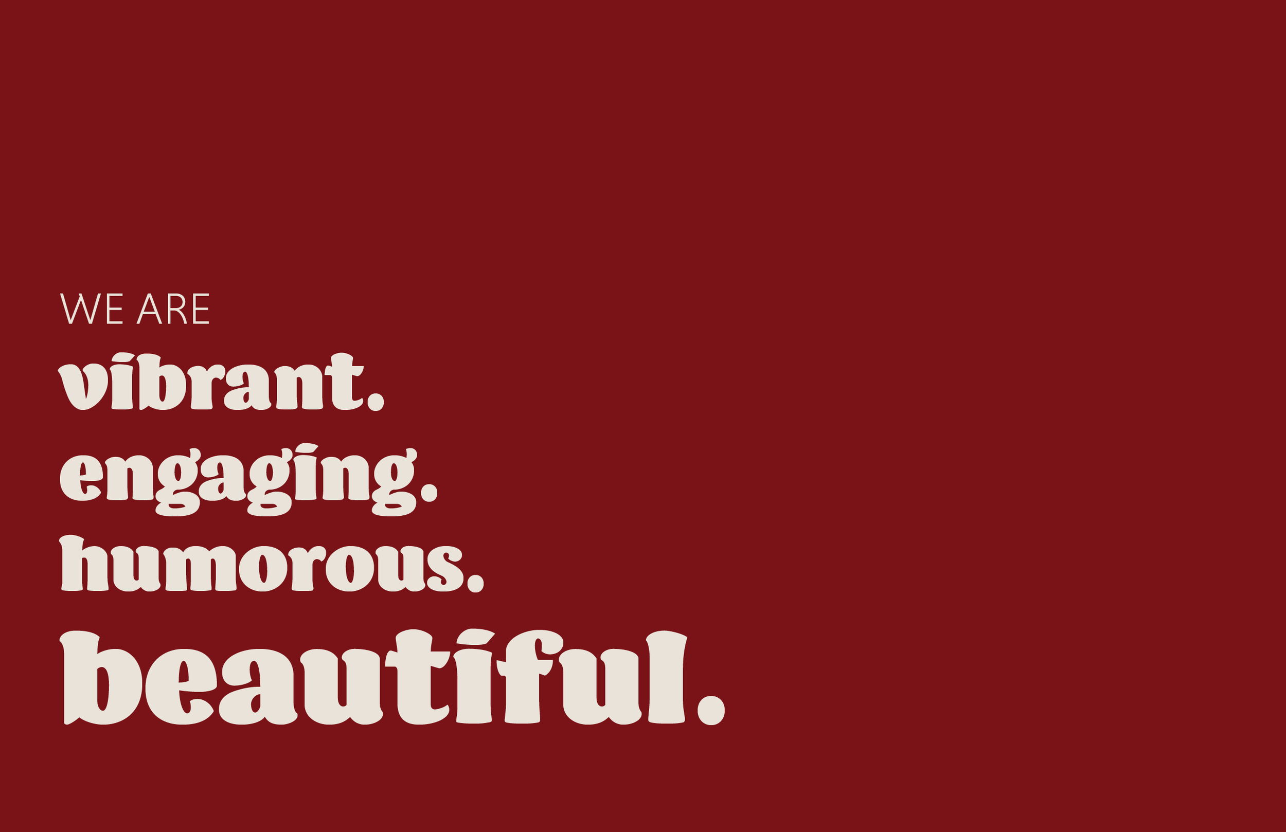
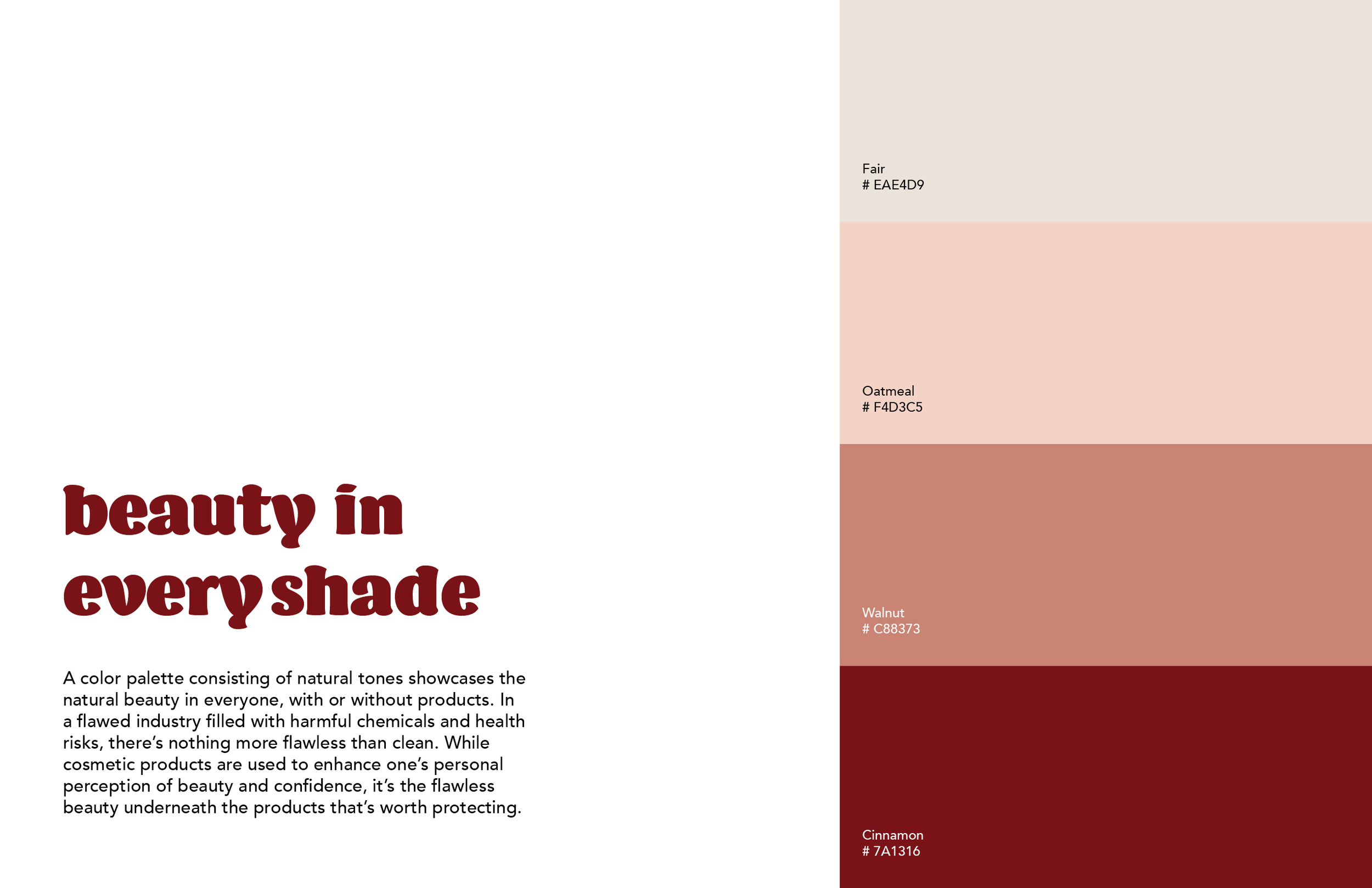
An emphasis was placed on color studies to develop a palette that feels relatable to the beauty industry while also having a more dramatic impact and depth. My early studies focused on an active range of colors that started to feel more active and sporty than the target. After this realization, I shifted focus to a more limited color range, and explored hue and saturation to add dynamics. Through explorations, I become more drawn to a palette that focused on neutrals and skintones. Feeling the most prevelant to the beauty industry, the color direction additional portrays a level of inclusivity and trust.
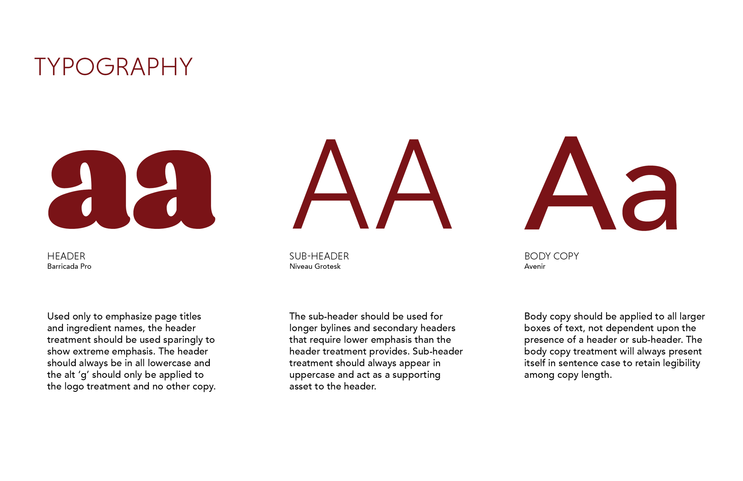
Typography exploration varied from serif to sans serif and a range of weights. While looking for a type approach that felt appropriate in emulating the beauty industry, I was also searching for a font that would be attention grabbing and make an impact.


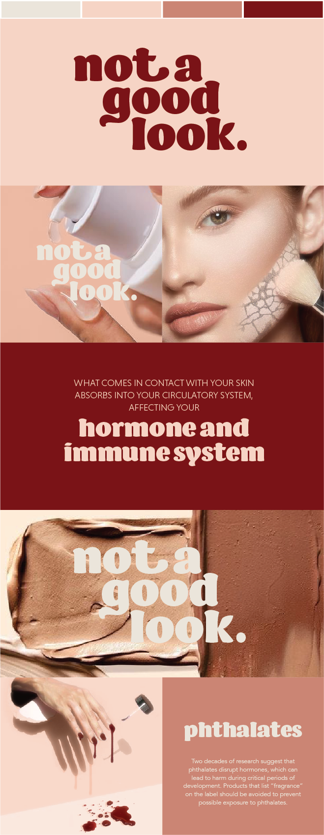
When it came to finalizing the image direction, I knew that I wanted strong enough visuals that they could live alone and really speak for themselves without text inclusion. By pulling on the image juxtaposition between beauty products and products that contained the same chemical of concerns, I had to be careful in selecting the alternative product to draw a comparison that was either inherently bad - or would get the viewer thinging deeper into the comparison.

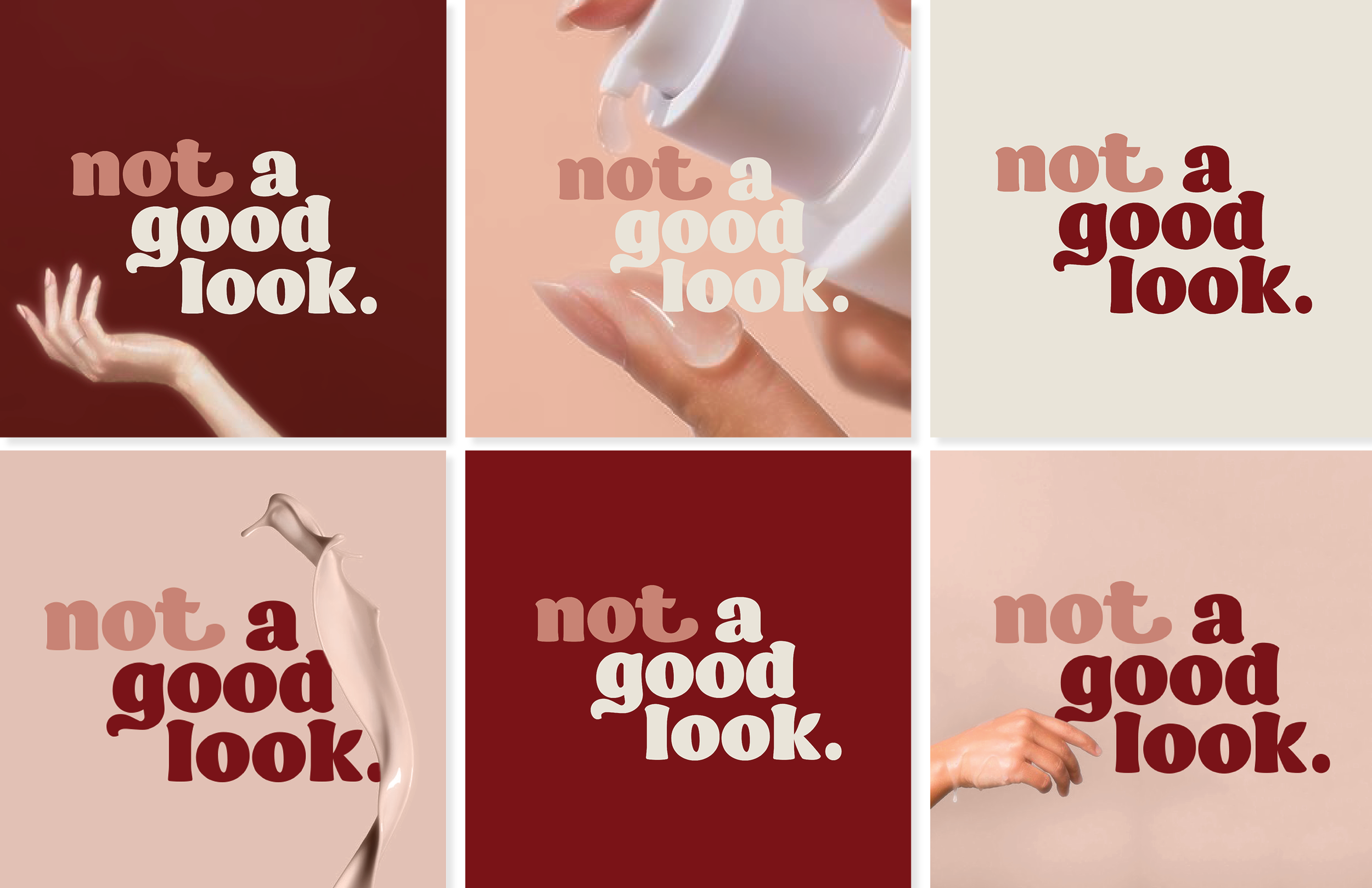
Branding

Check out the full brand guide for a more in depth look at the parameters and values upheld through the campaign touchpoints.
Final Platform
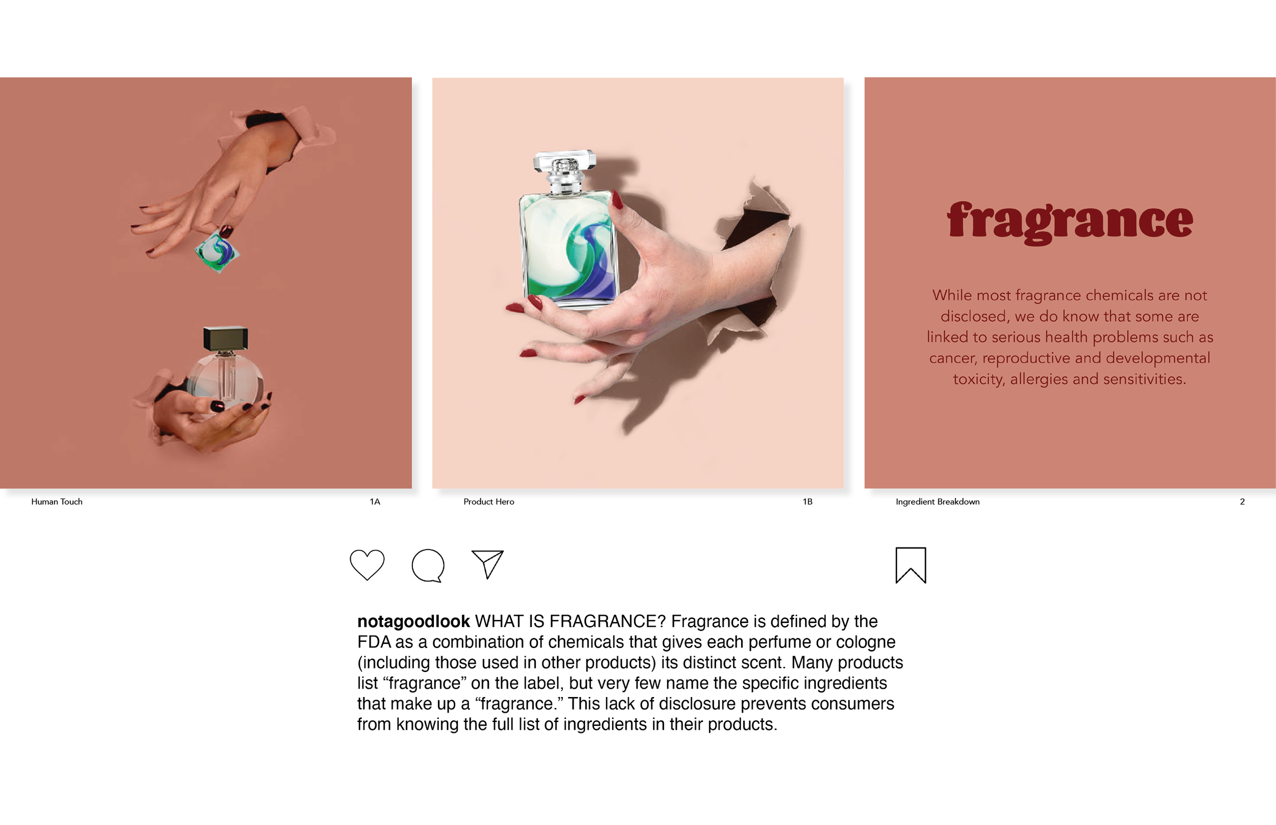
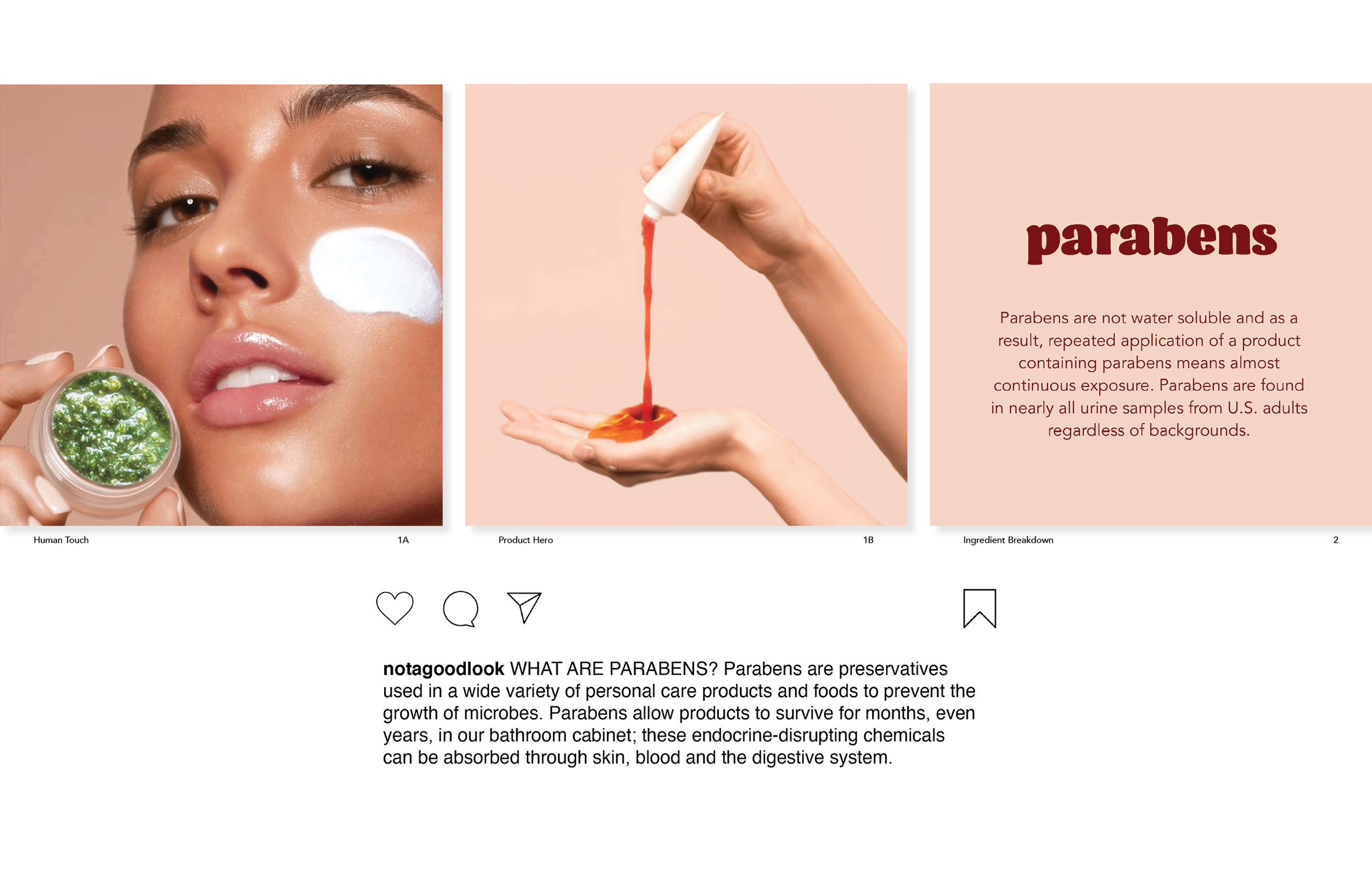
As the campaign is centered around social media, the social grid acts as the primary information touchpoint. Containing three different kinds of posts and depth of information, the emphasis seen through all is placed on visual language. By remaining focused on mobility, the viewer is able to not only analyze their current beauty selection, but also have easy exposure to an information library in store before purchase selections are made.
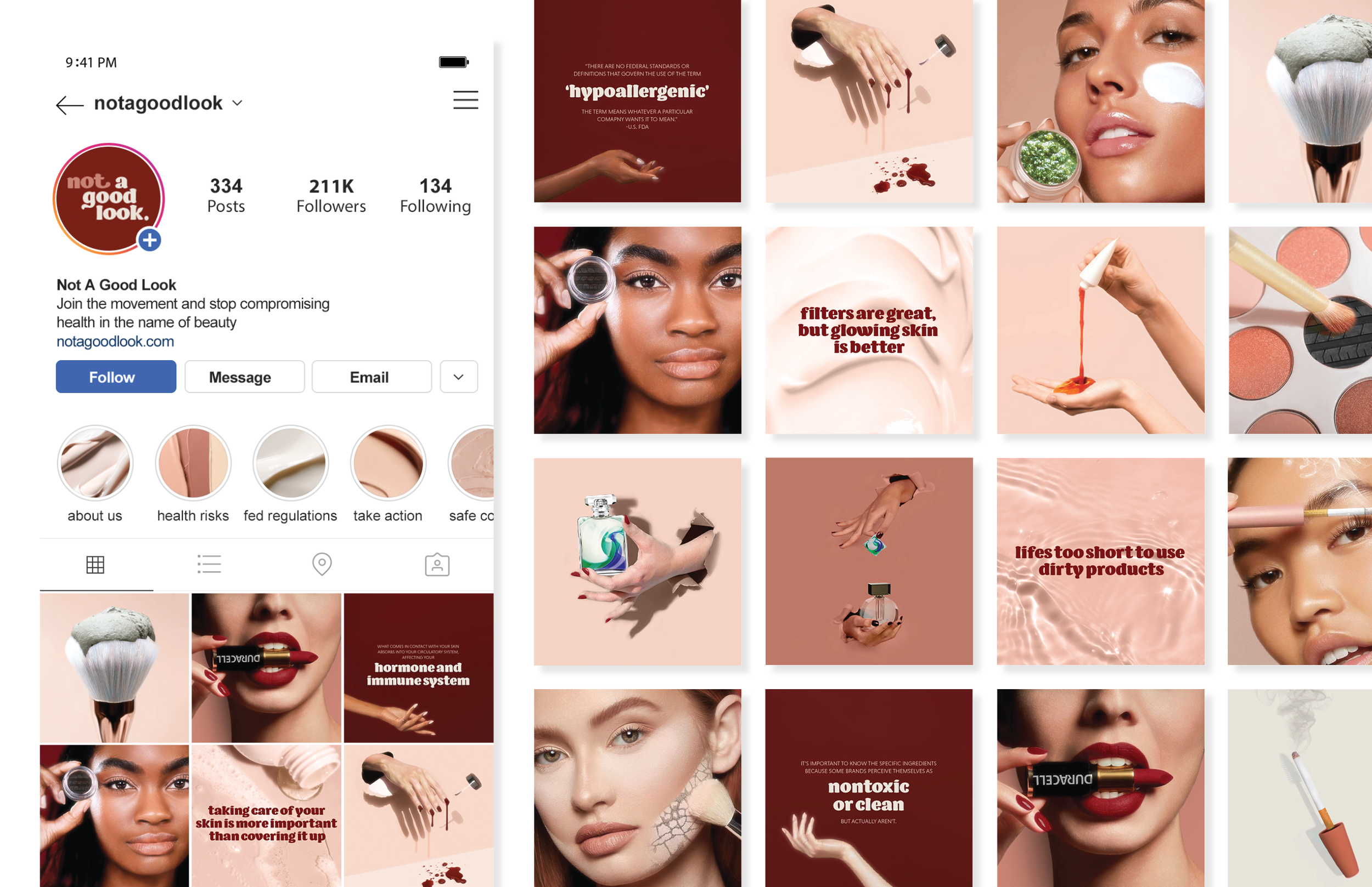
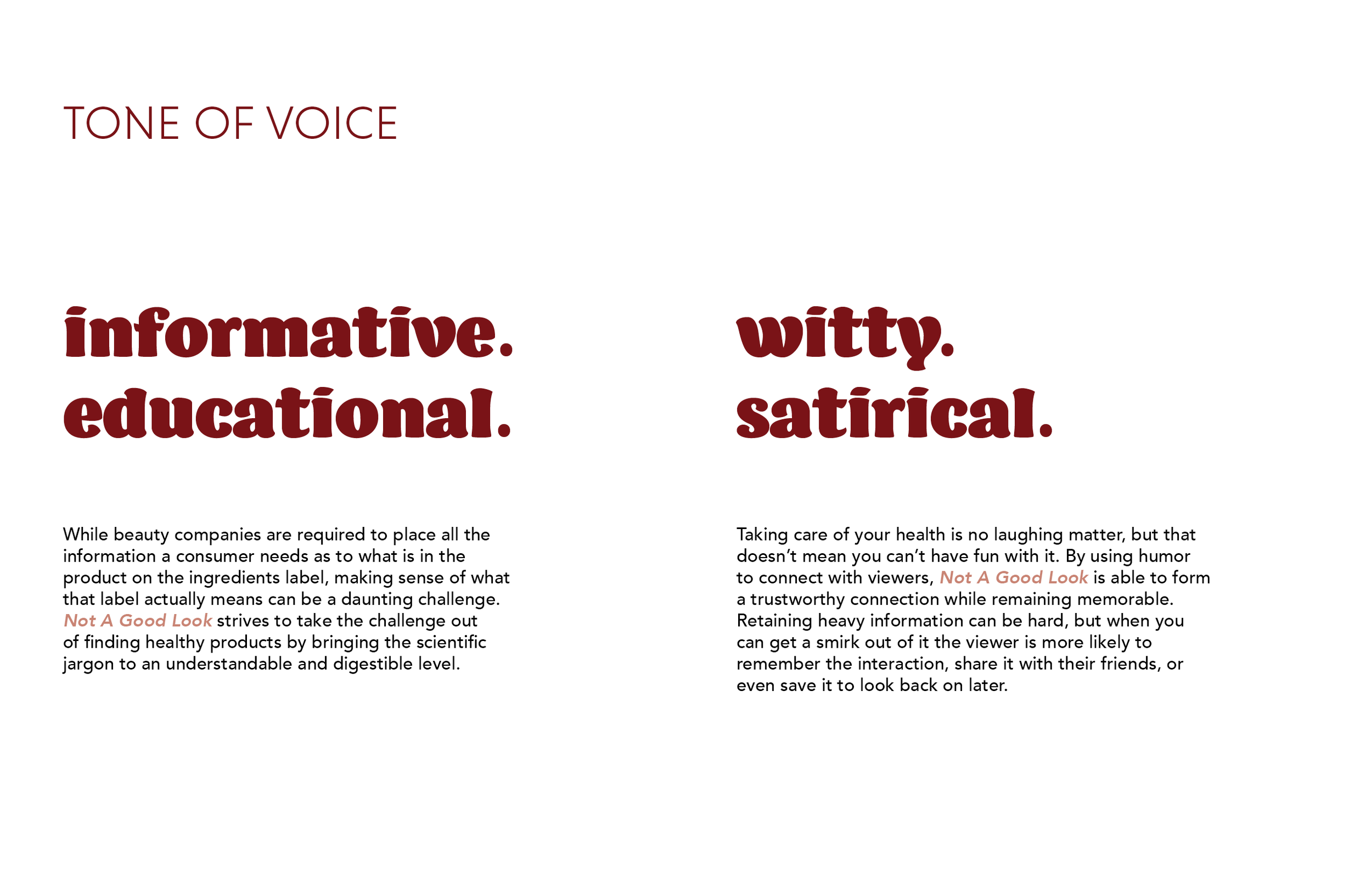
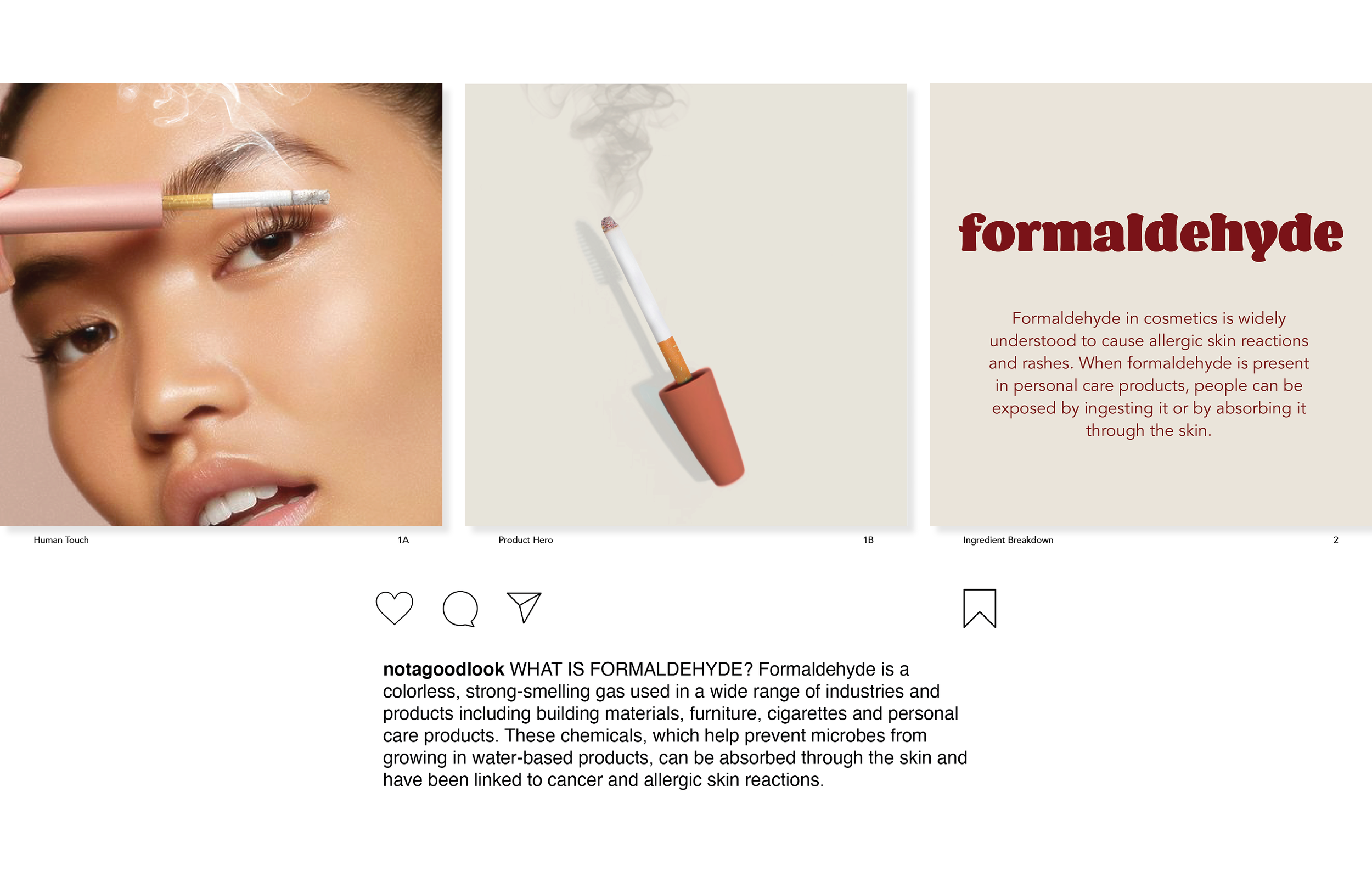
The main posting style pulls comparisons between chemicals of concern and the beauty products they’re found within. This is communicated to two styles - human touch and a product hero shot. Both are carousel posts with the first slide letting the image speak clear an uncluttered by text, and the second being an information slide of the of the chemical and the health concerns centered around it. For even more information beyond the post, the caption goes into greater detail of what exactly the chemical is. The secondary posting style consists of supporting images that work to break up the grid and provide general facts and information into health concerns in beauty as well as sharable moments to instill change.

Being the second information touchpoint from the direct grid, stories allow for the viewer to learn more information overall, or in specific category of interest. The story categories are centered around areas of more information or providing deeper insight to categories for actionable change. As a background element to the main feed, the stories highlights are made up of the background imagery assets to allow a primary focus on the main feed.

Learn more and engage with Not A Good Look. at the following sites